Just like would in person, you should try and make a stellar first (digital) impression with your website. After all, it could be the only chance you get to represent yourself, and show the world what you have to offer.
Within this article we’ll discuss a few key elements to help you do that. And show a number of examples from firms of all shapes, sizes, and specialties to provide, dare I say it, inspiration. That’s enough from me. Let’s get into it, shall we.
Introduction to Consulting Website Design
The essence of a well-designed consulting firm’s website is not just about aesthetics—you need function, form, and to facilitate your business’ growth. A great website – one you should aspire to have – should amplify your firm’s value proposition and persuade potential clients that you’re the go-to experts in your respective field.
User-Friendly Navigation
To begin, you have to ensure your website is easy to navigate and “use” for your prospects. Intuitive navigation is the cornerstone of user-friendliness. It assures that visitors find what they need without hassle. Instead of opting for industry jargon and complex menus, choose to stand out for a straightforward menu and internal linking that guides visitors through your service offerings, content, and insights with ease.
Clear Product Offerings and Services
When it comes to productizing your consulting services, clarity is the key. McKinsey & Company presents its services and offerings in a readily digestible format, making complex business solutions look simple and approachable. With your website, that should be the goal. Simplify your offerings to establish interest.
Effective Use of Color and Typography
Poor choices in color can make a significant impact, so let’s make sure to stay away from some well known faux pas so we don’t publish a website that comes off as amateurish. Steer clear of an excess of bright or clashing colors and maintain a consistent and harmonious color scheme throughout the website. Opt for a color palette that is easy on the eyes and complements the content. You’ll find it will enhance the overall user experience and can validate your professionalism.
Client Testimonials and Case Studies
Nothing speaks louder than success stories. To the extent you can, integrate client testimonials and detailed case studies to illustrate your impact and expertise in the consulting arena. With most things, I’d recommend moderation. But with case studies, more is more! Publish as many as possible.
Clear Call-to-Action Buttons
You’ve hooked your visitor’s attention; now what? You should have a compelling call-to-action that stands out without appearing pushy. Instead, it should gently nudge prospects down the conversion funnel. Please do not make it difficult for your prospects to get in touch and learn from you! Get out of your own way, and make sure to have a clear CTA.
Examples in the wild
Telling you what a good website looks like is one thing. How about I show you? Below you will find 39 different examples of solid consulting websites. I’ll also include the merits of each.
Corporate Consulting websites
The first 17 examples we’ll go through are corporations. Larger consulting orgs that have multiple offices, large customer footprints, and multiple service offerings. If you’re a part of a larger consulting org, or with to start one, these could be solid benchmarks.
Orchid.Black
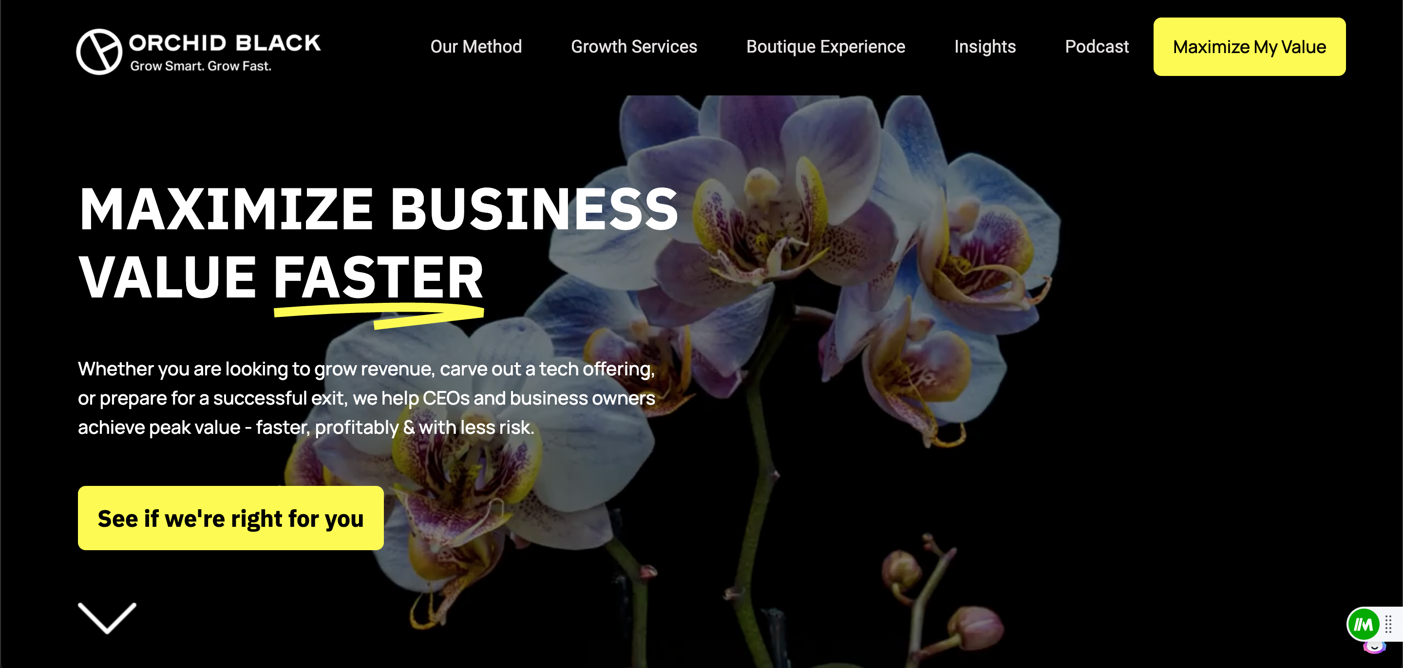
First off, the mission statement. Right when you visit you realize what you’re doing there. If you’re on the site, you’re searching for ways to “Maximize business value faster”. They cut to the chase, and draw you in with the awesome orchid detail in the back, the aggressive color way, and two GREAT CTAs. “Maximize my value” (Yes, please) or “See if we’re right for you”. The latter feels almost easy going…like, the reasonable answer would be…”Sure, why not”. Has all the basics covered and some panache, to boot. Great site!
PixelPlex
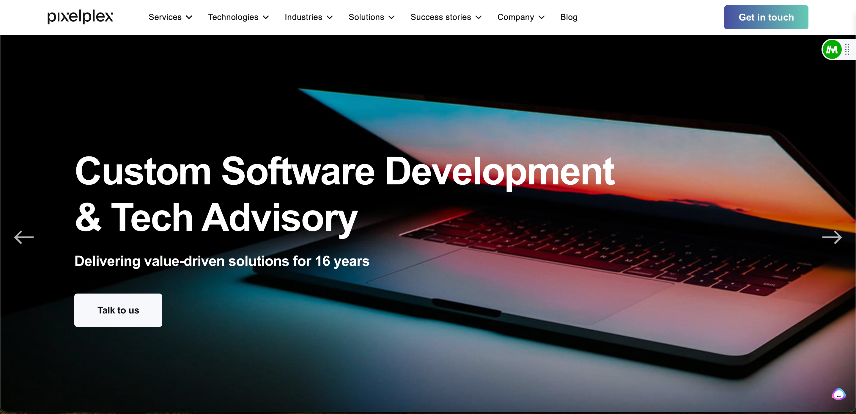
It might be unfair, but if you’re a dev agency or a creative agency there’s an elevated expectation. PixelPlex delivers. From the homepage you can easily navigate to find their service offerings, case studies, team, industries they serve, and loads of social proof. If you were in the market, you’d have plenty of chances to “Drop a Note” or “Get in Touch” due to various CTAs distributed through their site. This website is simple and effective. What consultant doesn’t love those?
Gaussian Company
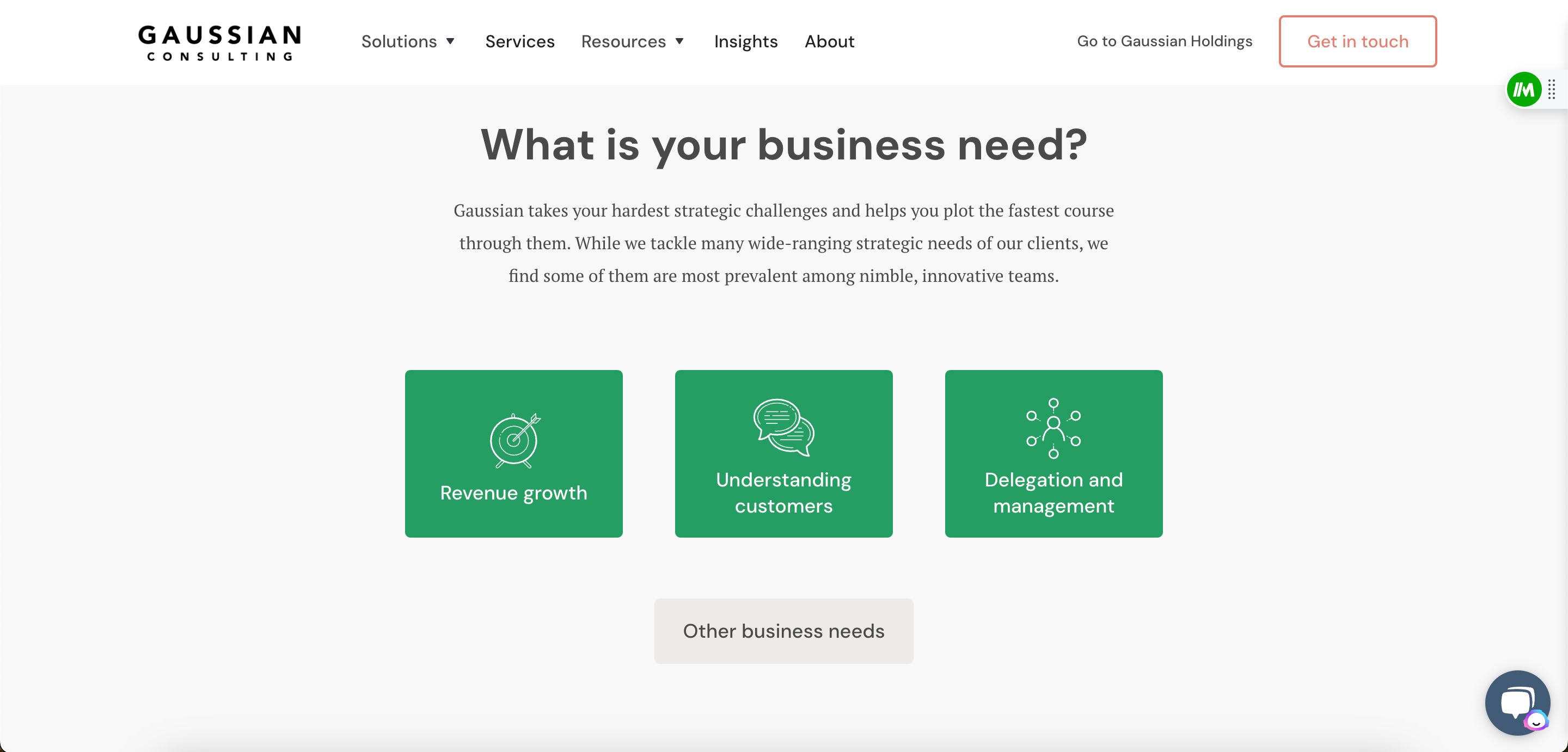
While Gaussian has a few business lines, I chose to showcase their consulting brand site. It can be very tempting to overload viewers with all your expertise and overload offerings. Gaussian chose to distill their offerings into 3 very distinct offerings (shown above). They used the green to contrast against their other more neutral tones, which adds a nice touch. If you visit the site, you’ll see links to “Get in Touch” and to view success stories and showcases of their work. Clean and concise, this one.
From Digital
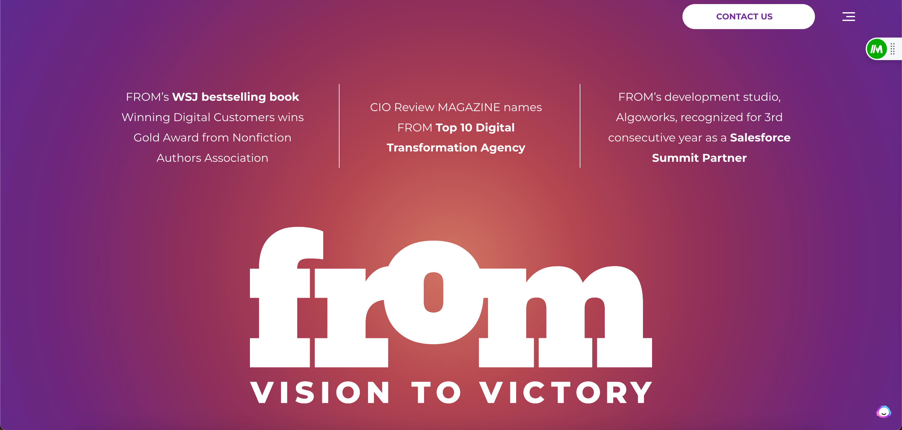
As an agency that specializes in Digital Transformation, you can see how From immediately differentiates itself from the pack. Bright colors, headless website within the first fold. All you can see are a few salient proof points and their brand. It almost tempts you to ask yourself, “What else is there?” which, I would image, was their intention all along!
Tronvig Group
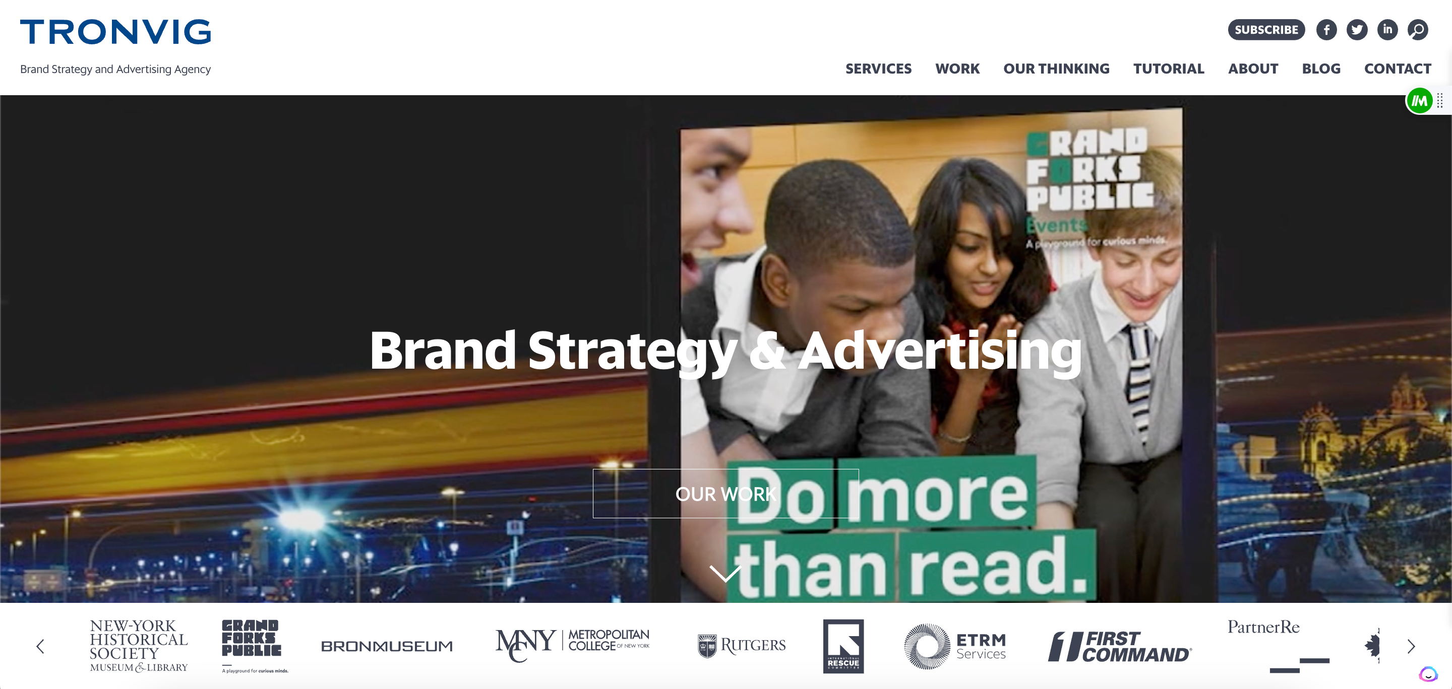
Tronvig has over 26 years of experience in advertising and strategy consulting. Notice anything from their site that’s a little different? They lead with their work. Not only do they showcase their actual advertisements in a picture carousel. They make it clear what they offer – and who they have worked with. This website means business!
Yonder Consulting

It’s clear Yonder is investing in their brand with their homepage and website. Their home screen (pictured above) hits you with bold colors and a strong tagline. Then, when you scroll down (pictured below), you get a more detailed explanation of what they do and how it’s different. Easily link to their team and their methodology. Great site that’s hard to forget!
Prophet
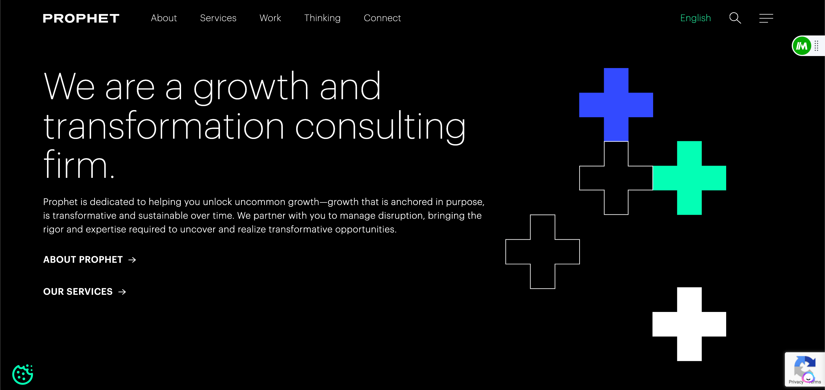
If you haven’t noticed by now, I am a sucker for clarity. It should be extremely easy for me to tell who you are and what you do, from your website. I’m not sure there’s a better example than the Prophet site. They start high – with Growth and Transformation – before adding additional detail within the body of a paragraph on their homepage. Then allow you to link to their services page and their team page or history.
Cornerstone Research
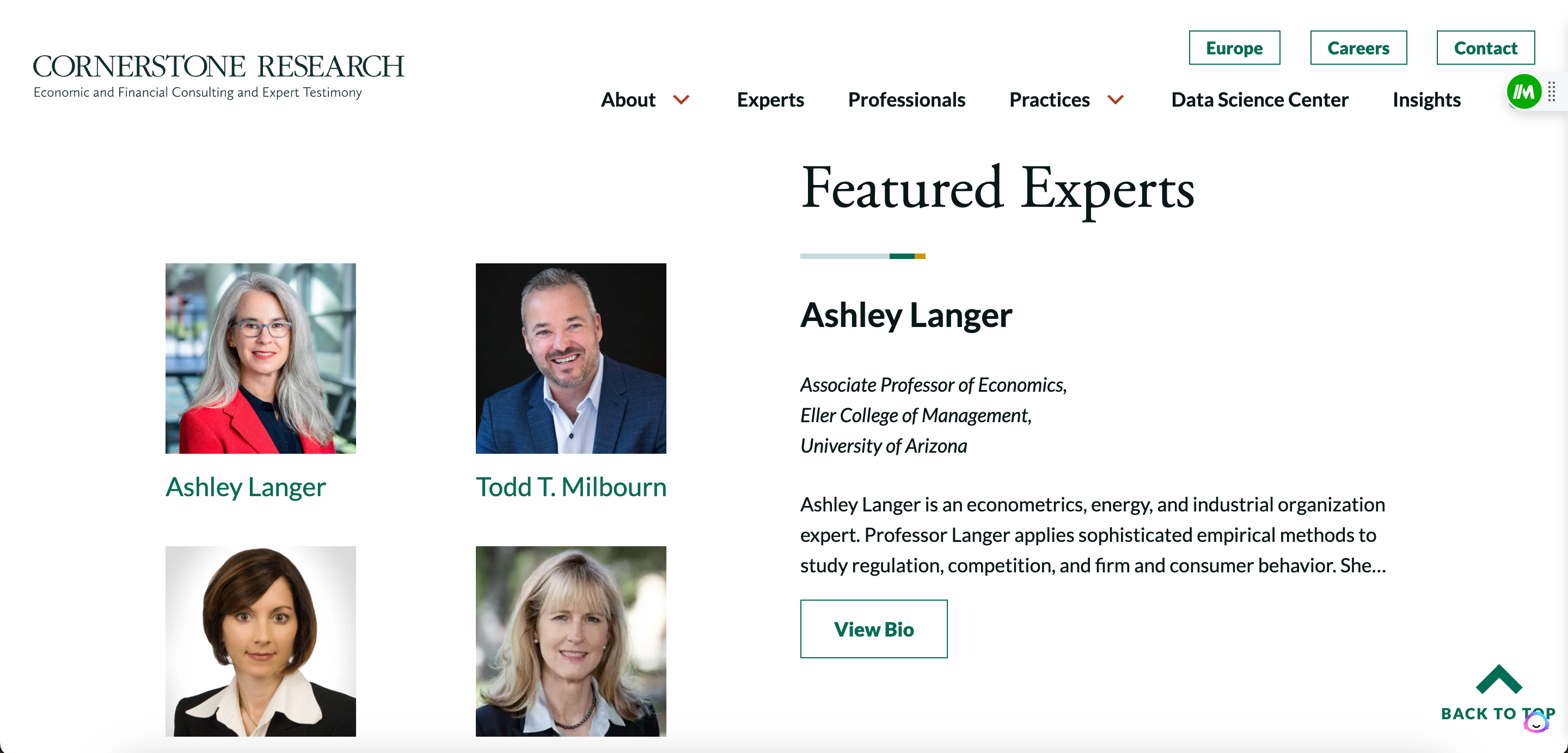
Leading with their experts! In consulting, YOU are your product. So, it can be an impactful strategy to showcase the strength of the experts you have and provide bios. That’s what the team at Cornerstone did. Their Header menu makes it easy to find additional information as well.
Brattle
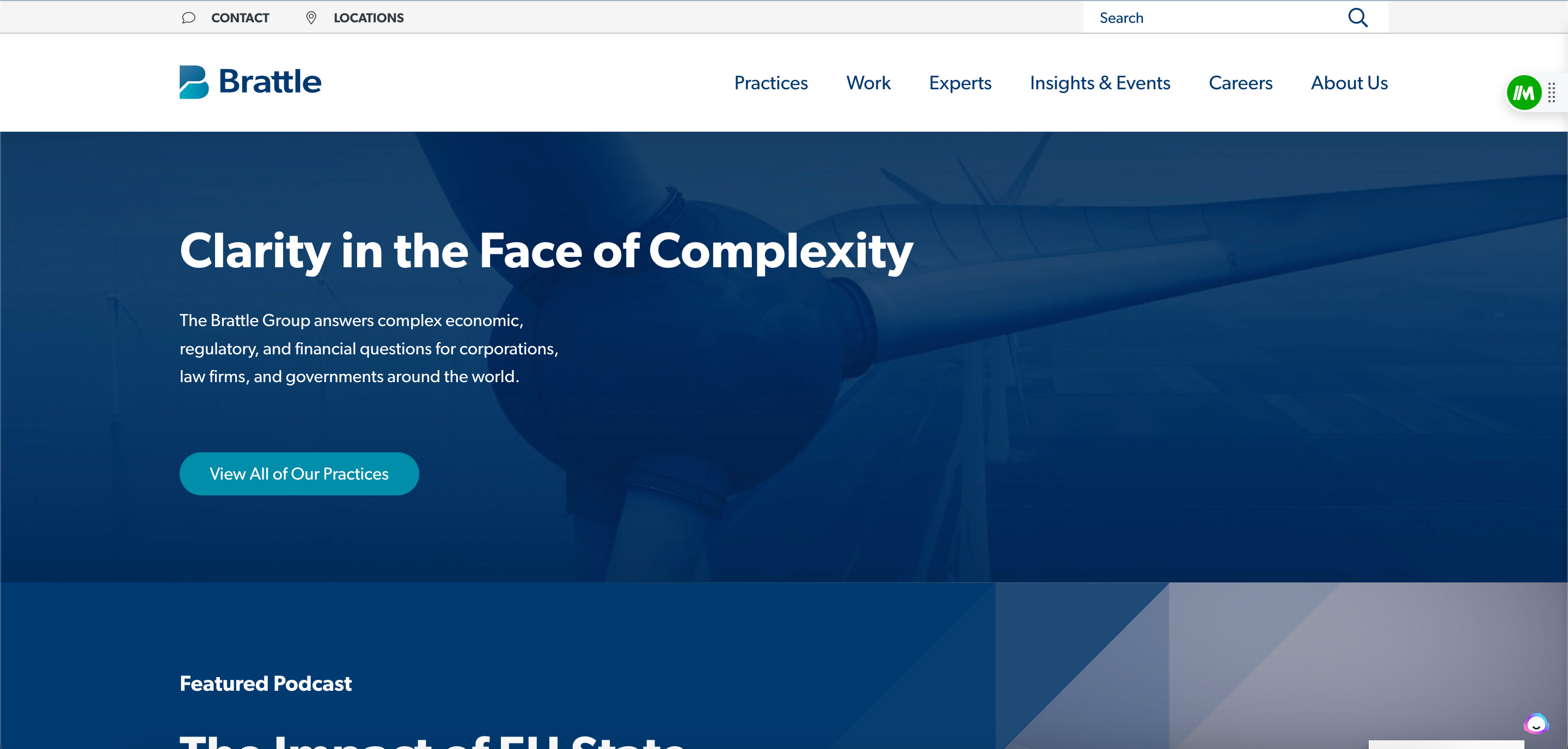
Right from the homepage, you can tell what Brattle does. No ambiguity there. What they’ve done, too, that’s very savvy is to start creating and publishing valuable content on their website – even creating their own podcast. The best part? It’s ungated. Like most things in life, when you give…you get! And Brattle does an excellent job here.
Chartis
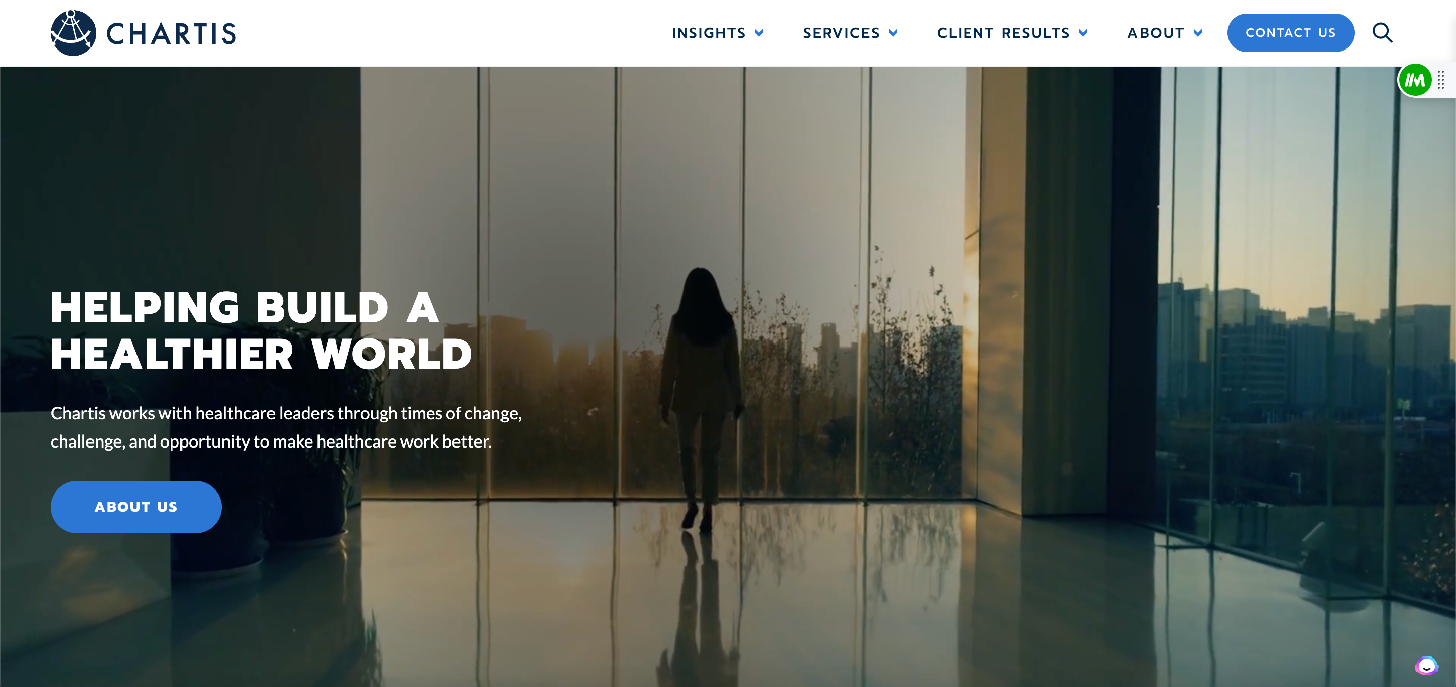
You might first think, “Well – what’s so great about this one?” The elegance is in the simplicity. With nearly 1,000 employees, Chartis can do a lot to help your healthcare org. But, instead of overwhelming their audience with lines of text or offerings, they simplified it. Insights, services, results, and the team. That’s what you get from this site and it’s a great reminder that, usually, that’s all you need!
Curinos
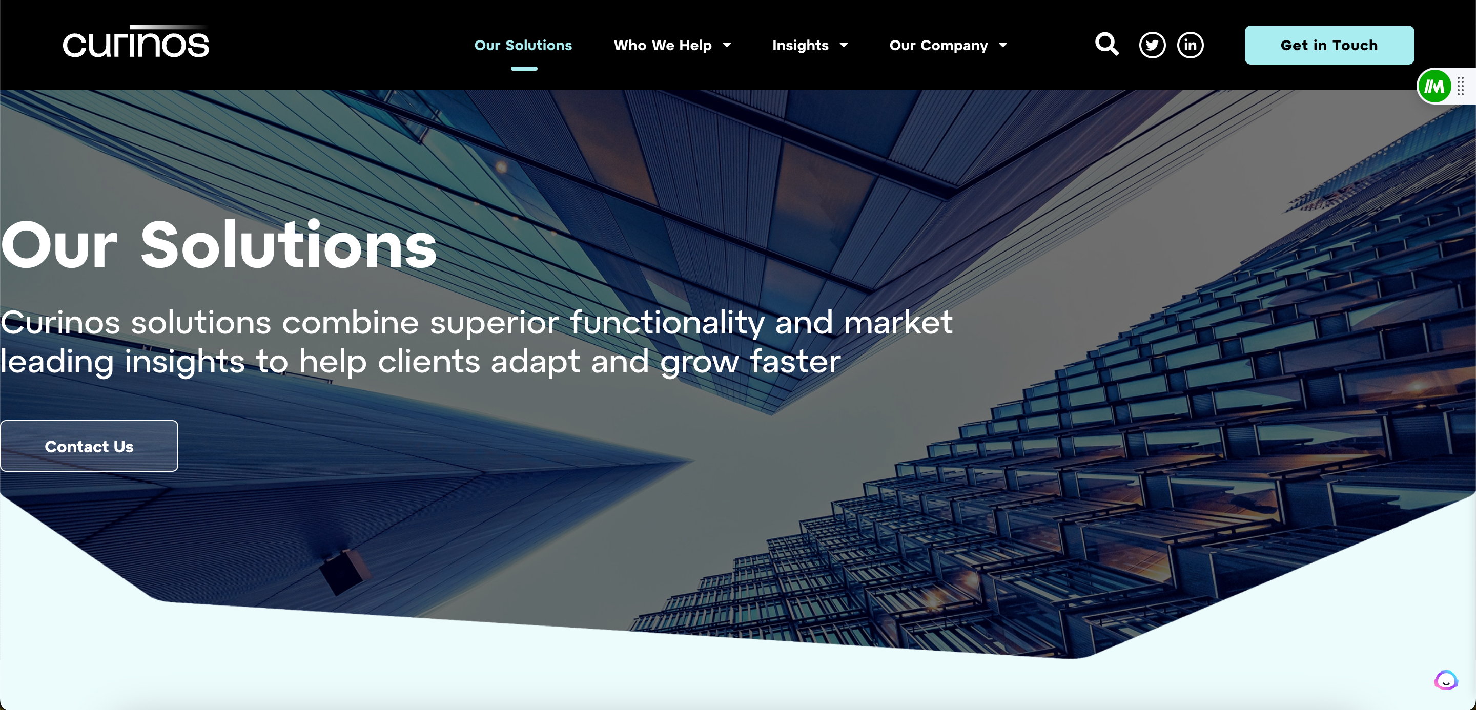
The graphics and design really set the Curinos site apart from me. The striking borders on their image and the videos that play are interactive and they elicit a certain emotion. And their colors go really well together, along with the spacing on the site and the overall layout. All that, plus they have all the vital details and easy to find CTAs.
ProPharma Group
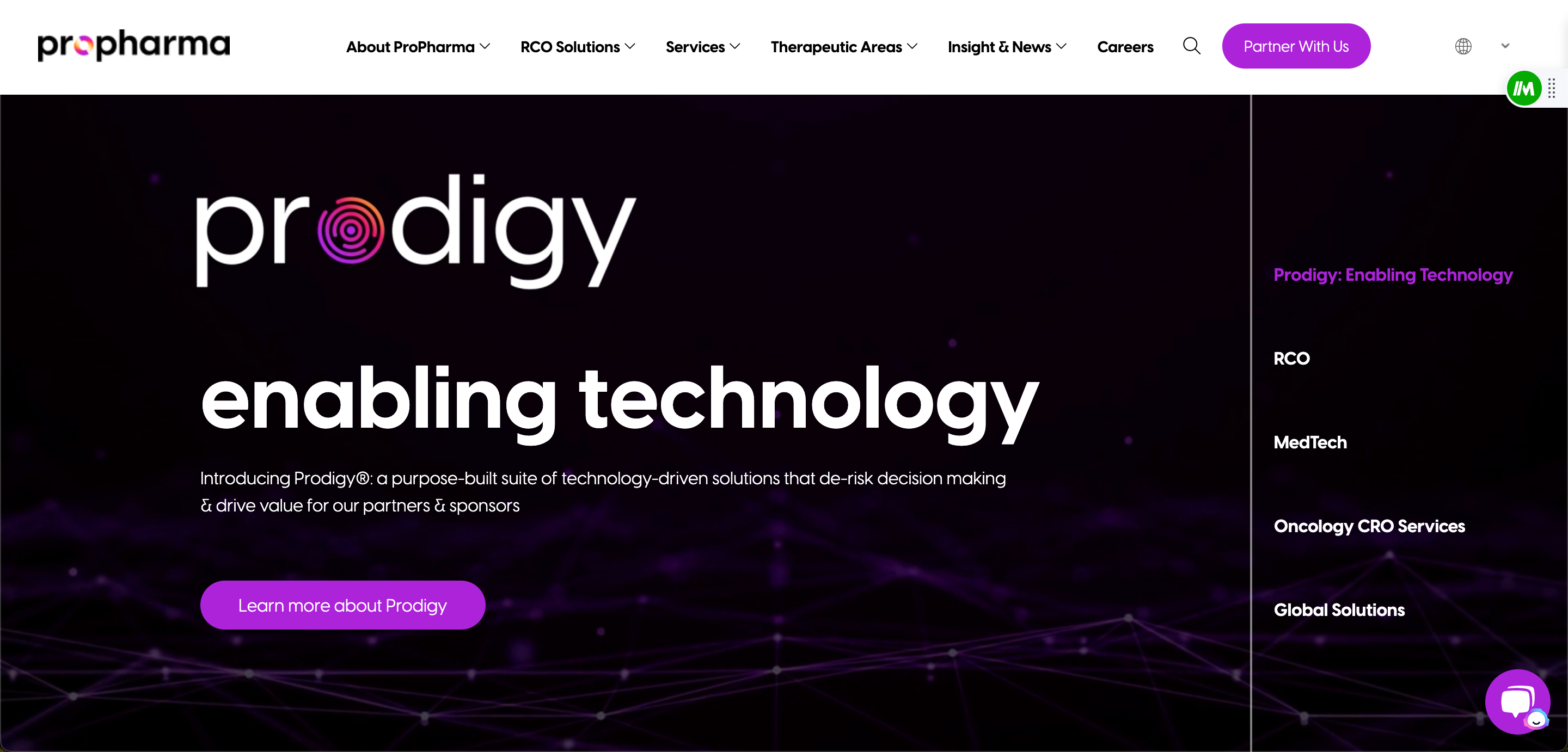
While ProPharma’s homepage is a little vague for my liking, their use of color and design really stood out to me. The gradients they use on their site and the numerous insights and white papers they provide clearly establish ProPharms as experts in the CRO space. And the chatbot is a nice touch!
Durable Digital
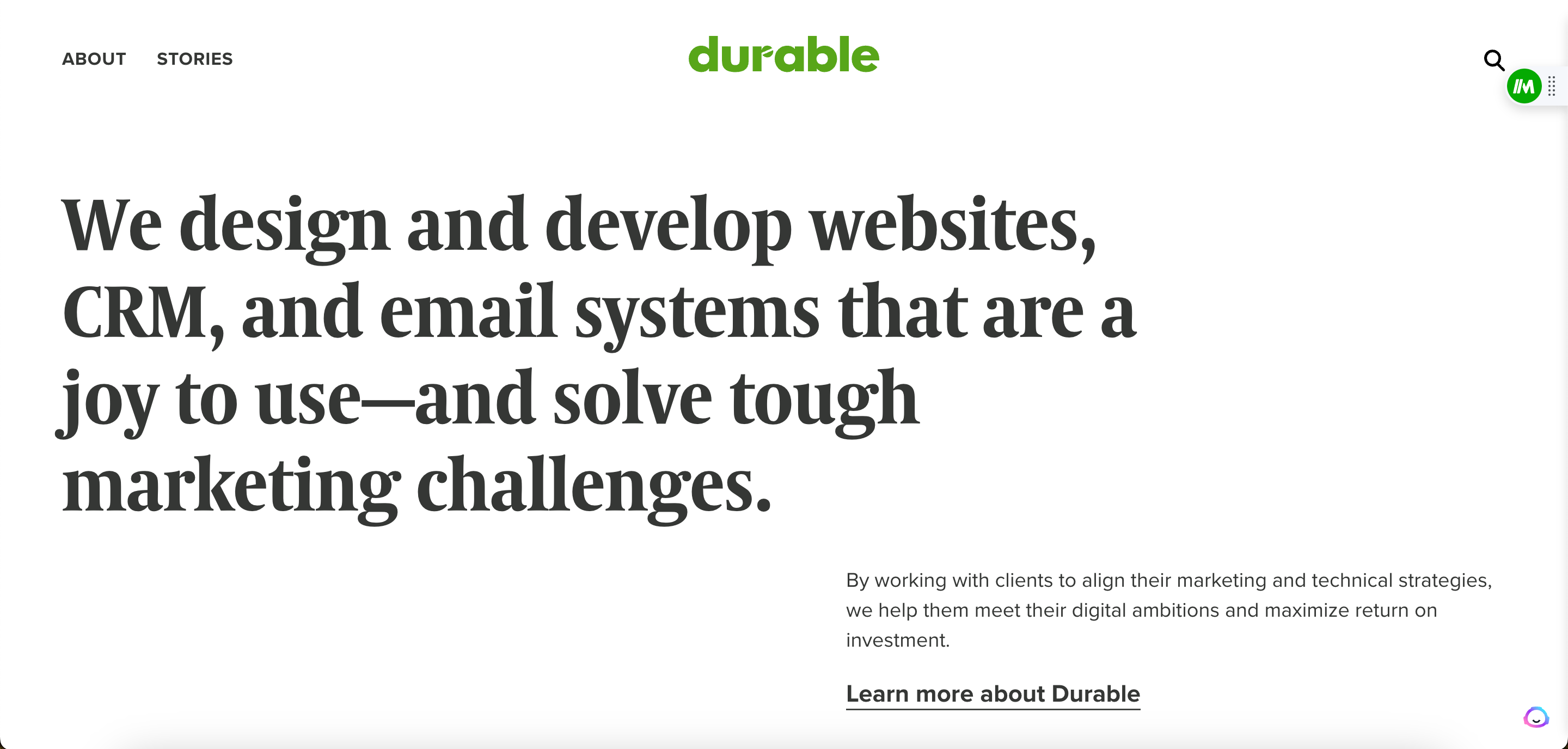
Do you know what I love about this site? Yes. It’s the simplicity and how straightforward their messaging is. There’s no mention of streamlining, optimizing, or [insert consulting buzzword here]. They specify their offerings and invite you to learn more about their customers and their firm. Only thing I’d do is add a more vibrant CTA on the site. But, with copy this good, they might get away with it.
Beta Acid
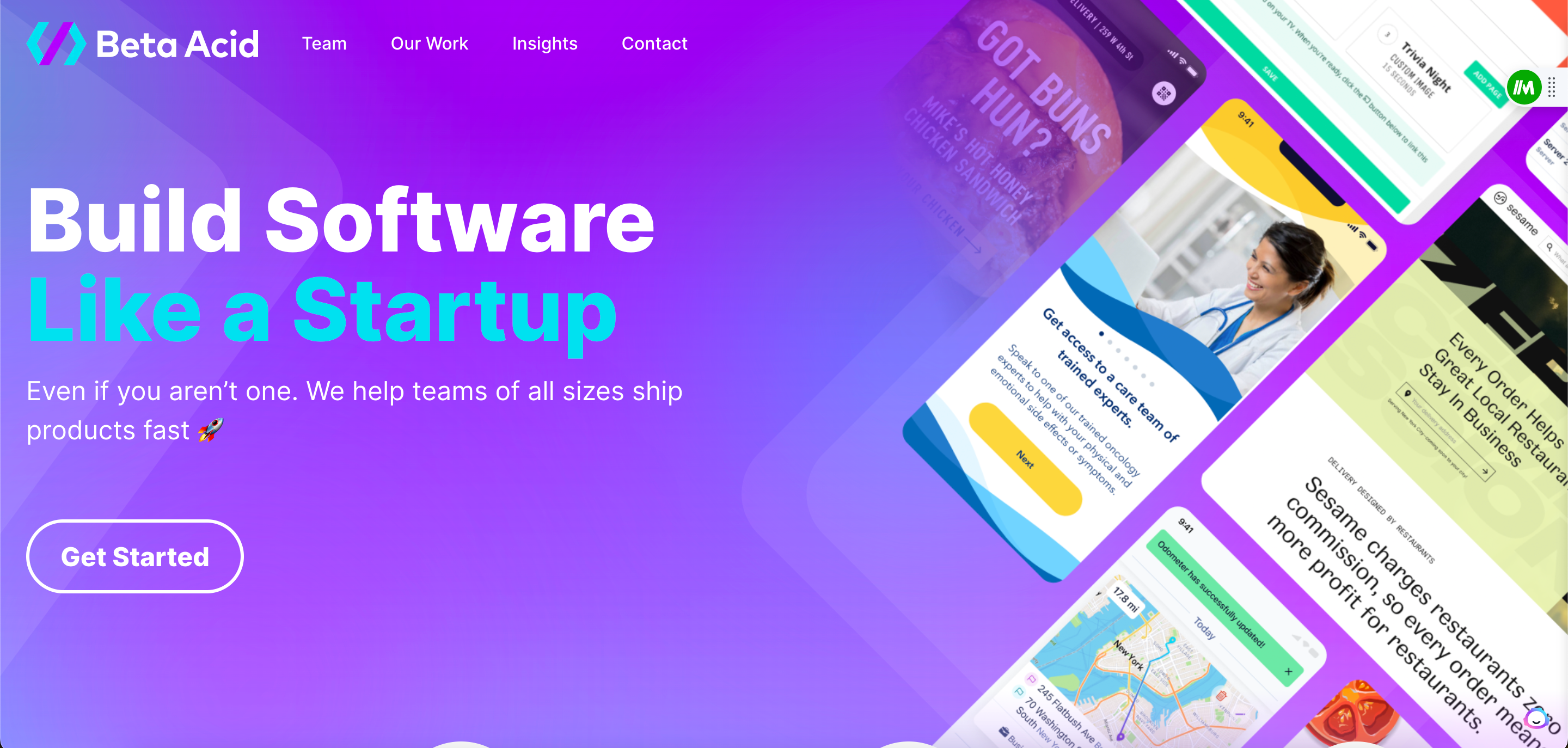
This website is on the list because of how playful and how energetic it is. I feel like we all have this “idea” of the old school consultants who, frankly, led the industry to get a bit of a bad wrap. Beta Acid is anything but old school. With an awesome user interface (UI), they also show how thoughtful they are about user experience (UX) which is imperative given they build technology!
JJELLYFISH
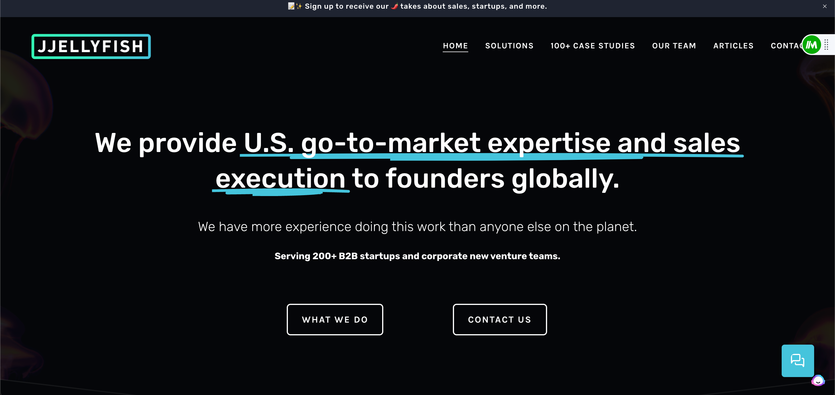
JJELLYFISH delivers a pithy explanation of who they are and then controls the journey with two distinct CTAs. One, a contact form. The other, more details on their business and access to over 100 case studies! The copy, color scheme, organization, and the chatbot make this a winner.
Blue Ridge Partners
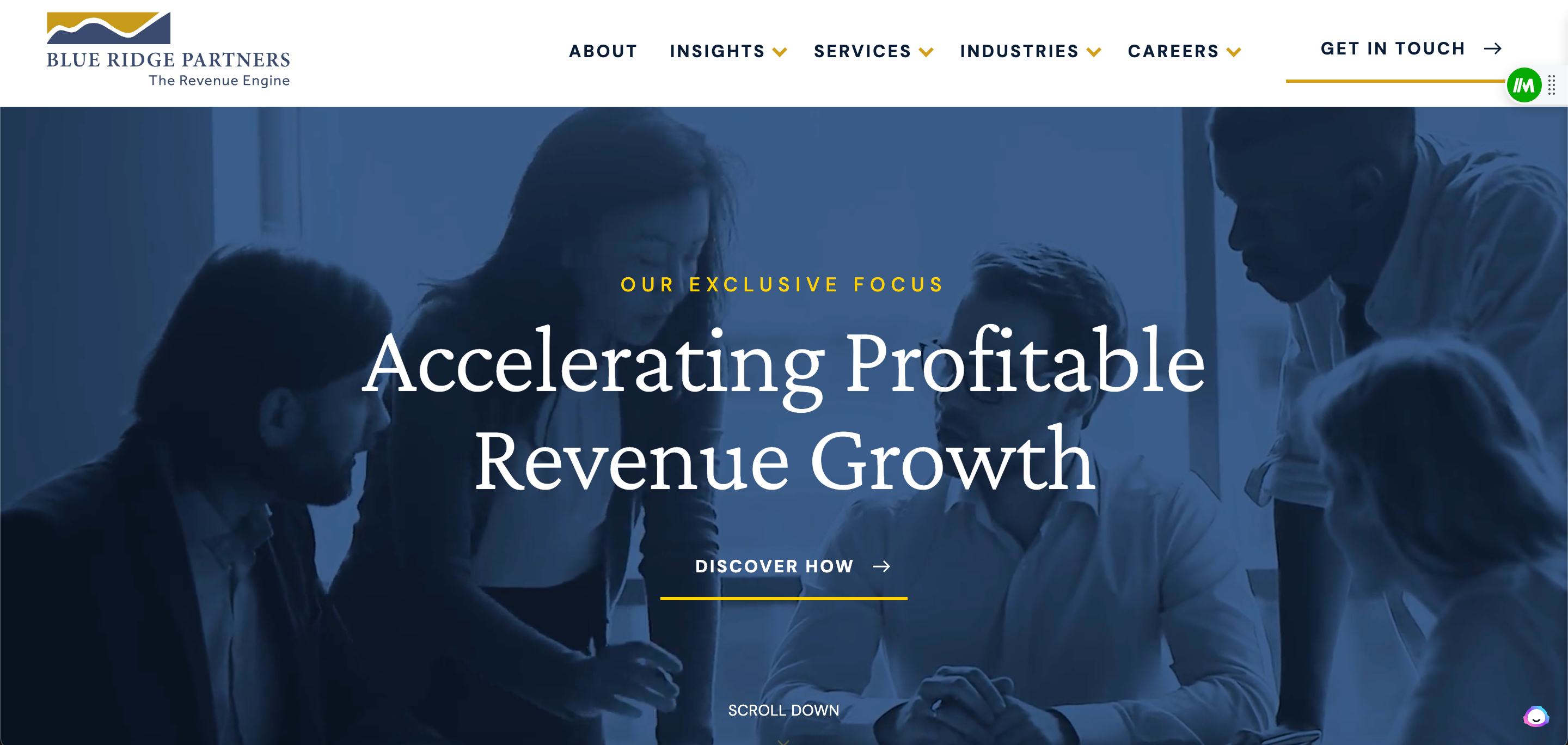
A little more old school. A little less flashy. All the same in terms of efficacy. Blue Ridge Partner’s site isn’t as exciting as some competitors, but their work speaks for itself. Which is why they lead their viewers to opt into learning about their methodology and the transformation they’ve delivered to other commercial clients. Great example of leading the narrative.
West Monroe Partners
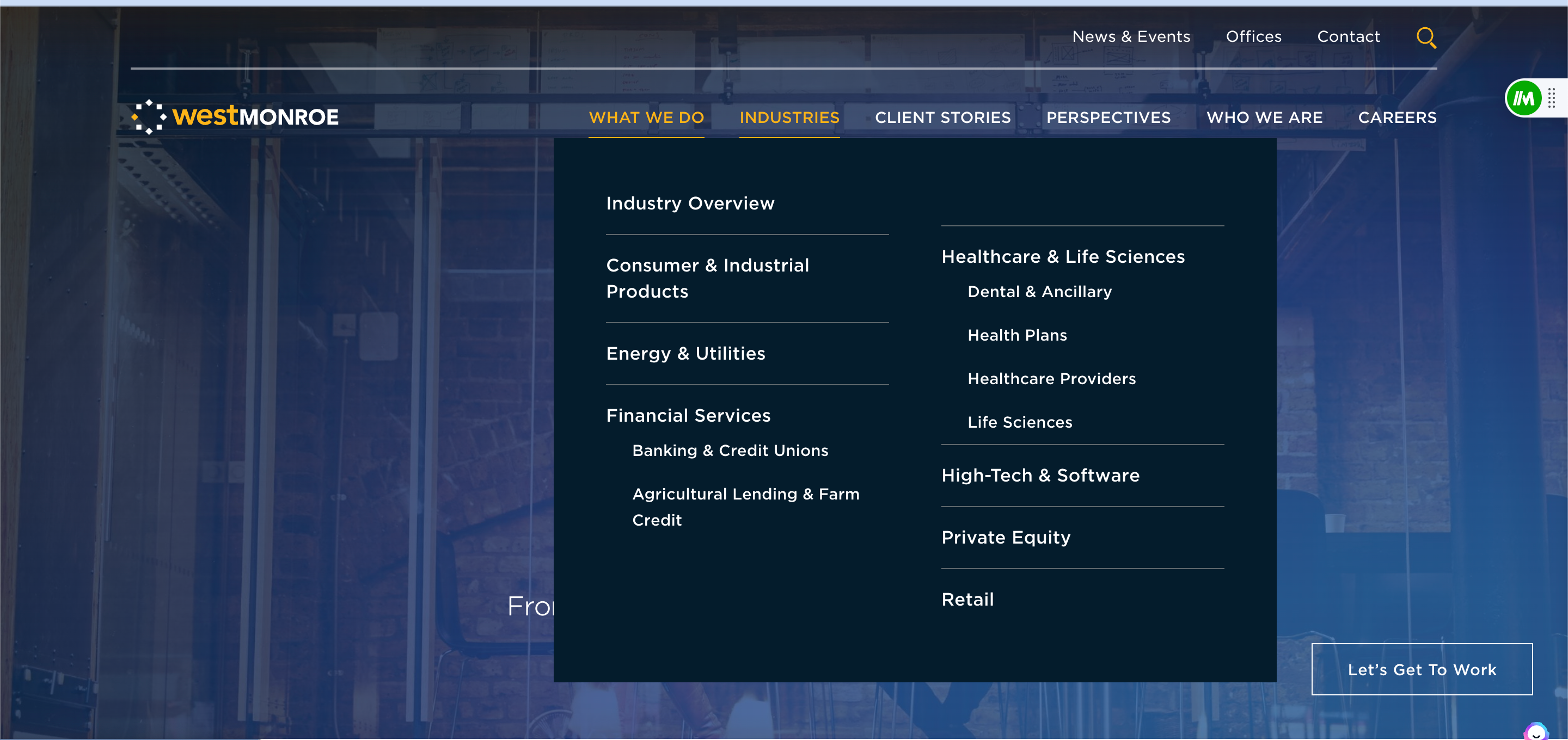
One of the larger companies on the list, West Monroe partners does a good job keeping things organized. Plus, I loved the fact the website is basically one big image overlay. With ease, but not being bombarded with it, you can find all the industries, testimonials, and perspectives offered by West Monroe. And, if you want, you can “Get to Work” by clicking their CTA and submitting a form.
Small Business Consulting websites
Tired of consulting website’s yet? I hope not! We’ve got 18 more examples waiting ahead. The difference with the next 18 is that these consulting firms are much smaller. There are nuances we’ll notice about small business consulting websites. A few to pay attention to are:
- Scale of Content:
- Small consulting firms may have a more concise website with limited pages, focusing on essential information about services and contact details.
- Budget and Design Sophistication:
- Small consulting firms might have more limited budgets for website design, leading to simpler layouts and less intricate design elements.
- Team and Expertise Showcase:
- Small consulting businesses may focus on showcasing key team members and their expertise directly on the homepage or a dedicated team page.
- Client Testimonials and Case Studies:
- Small consulting firms may prioritize a few impactful client testimonials and case studies to establish credibility.
- Contact and Inquiry Handling:
- Small firms may provide straightforward contact forms or direct email addresses for inquiries, with a more personalized response approach.
- Global Presence and Multilingual Support:
- Small consulting firms may focus on a specific local or niche market, providing content in a single language.
- Resource Libraries and Thought Leadership:
- Small consulting firms may have a basic blog or resource section, sharing occasional insights and thought leadership pieces.
- Technology and Innovation Showcase:
- Small consulting firms may focus less on showcasing advanced technological capabilities on their websites.
- Social Media Integration:
- Small consulting firms may use social media platforms for basic promotion and may have simpler integration on their websites.
- Compliance and Security Information:
- Small consulting firms may have basic privacy and security information on their websites.
Well, that’s enough talk Let’s get to it…
Apex Revenue
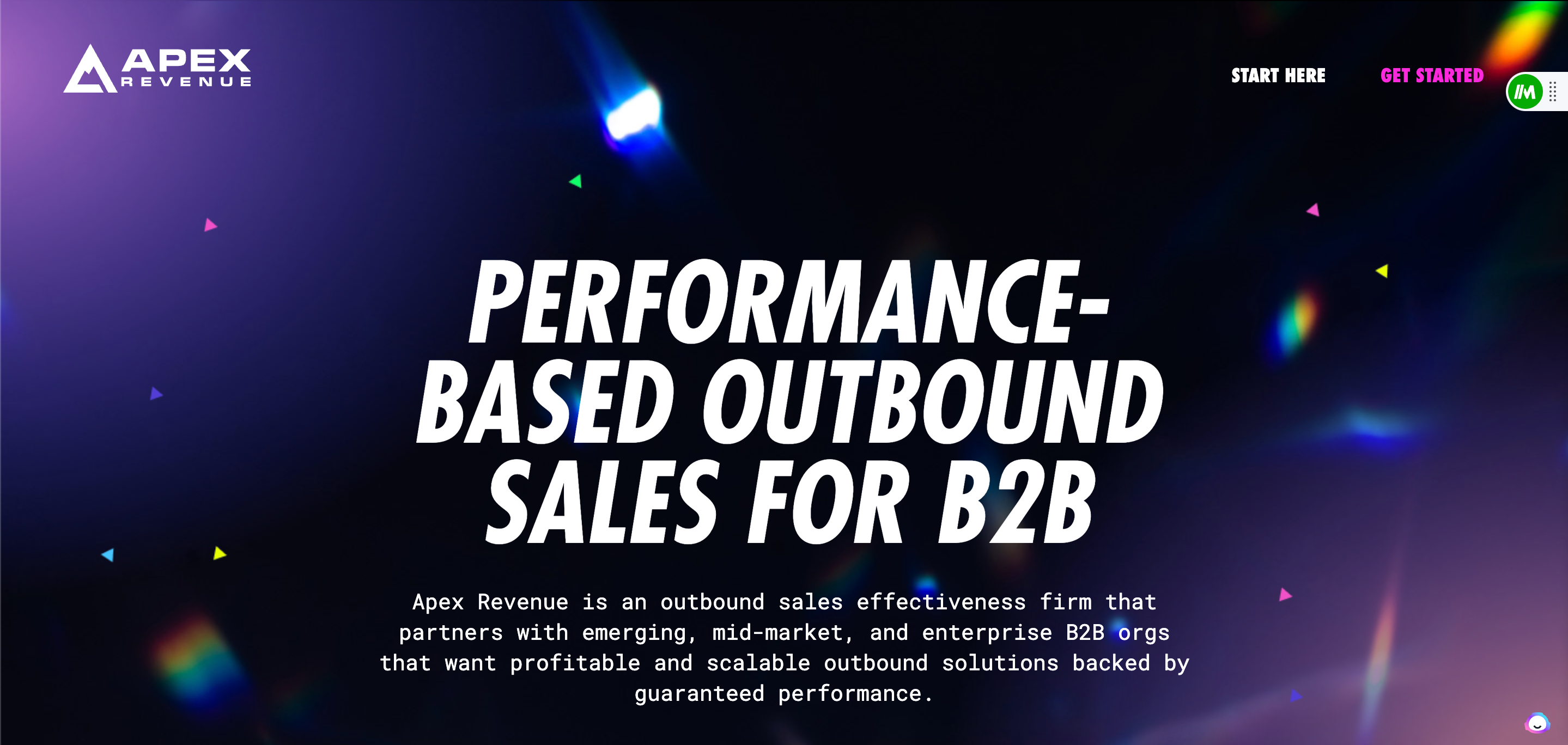
You don’t have to be a large, multi-national consulting firm to offer a world-class digital experience. Don’t believe me? Just ask Apex Revenue. Testimonials, insights, and the ability to schedule a discovery call directly from their website. Let me tell you, Apex Revenue is not playing around!
Pelham Advisors
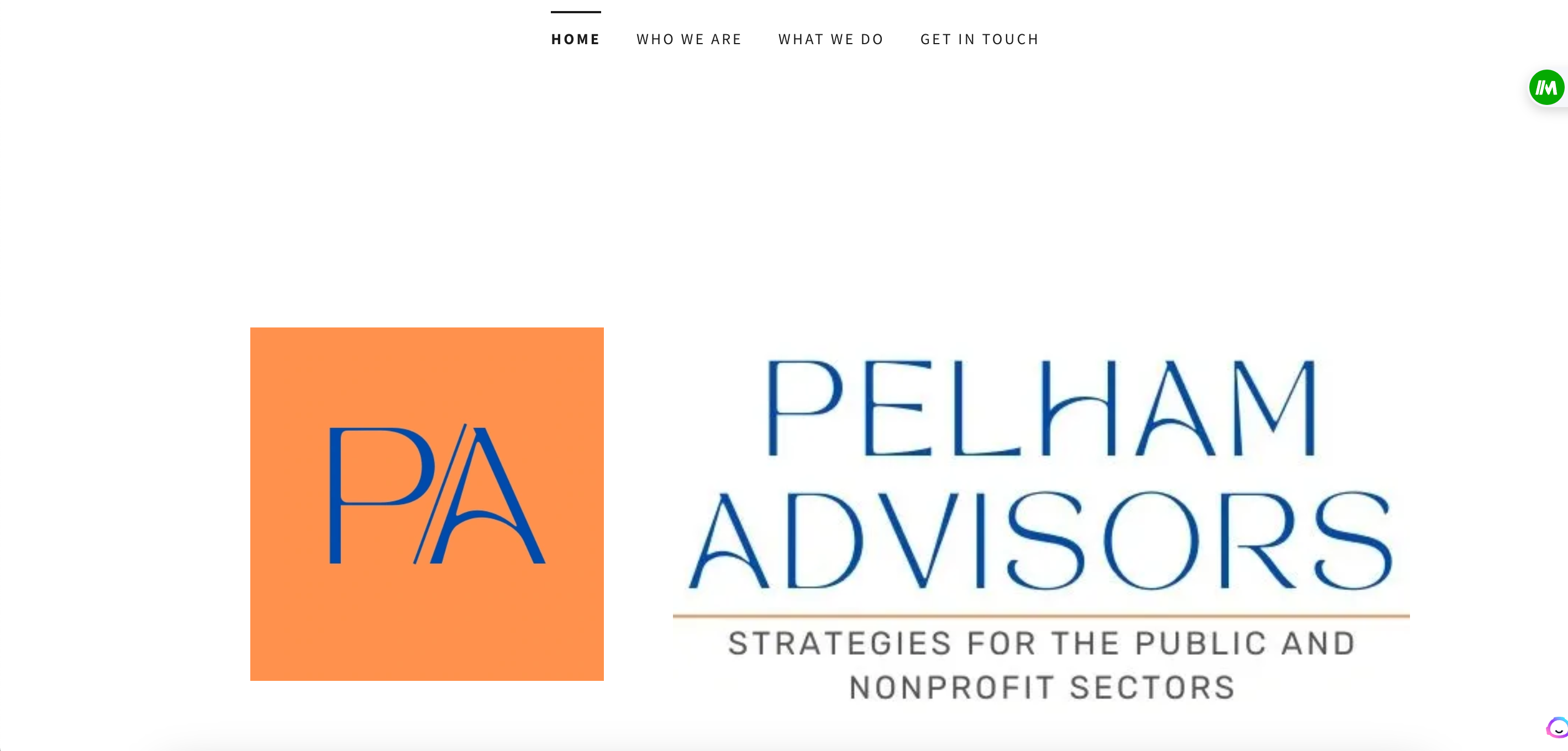
Most of the sites I’ll show are visually stunning…but they don’t have to be! The same core tenets that make a large consulting website effective, remain for small business consulting websites. The main difference is small business sites will be a bit more simple, and less “robust” when it comes to content. While the sheer volume might not be there, when it comes to offerings and presence and customer stories, the quality should be.
Salman Sales Academy

I really like what this sales consultant did. They have a hypothesis on what their buyer (salesperson) might be looking for and they introduce a really compelling offer, right on the homepage. Anybody spot it? They have a sales community you can join BY salespeople FOR salespeople. A very psychologically forward approach to gaining interest by our friend, Salman!
Discoverycoach.io
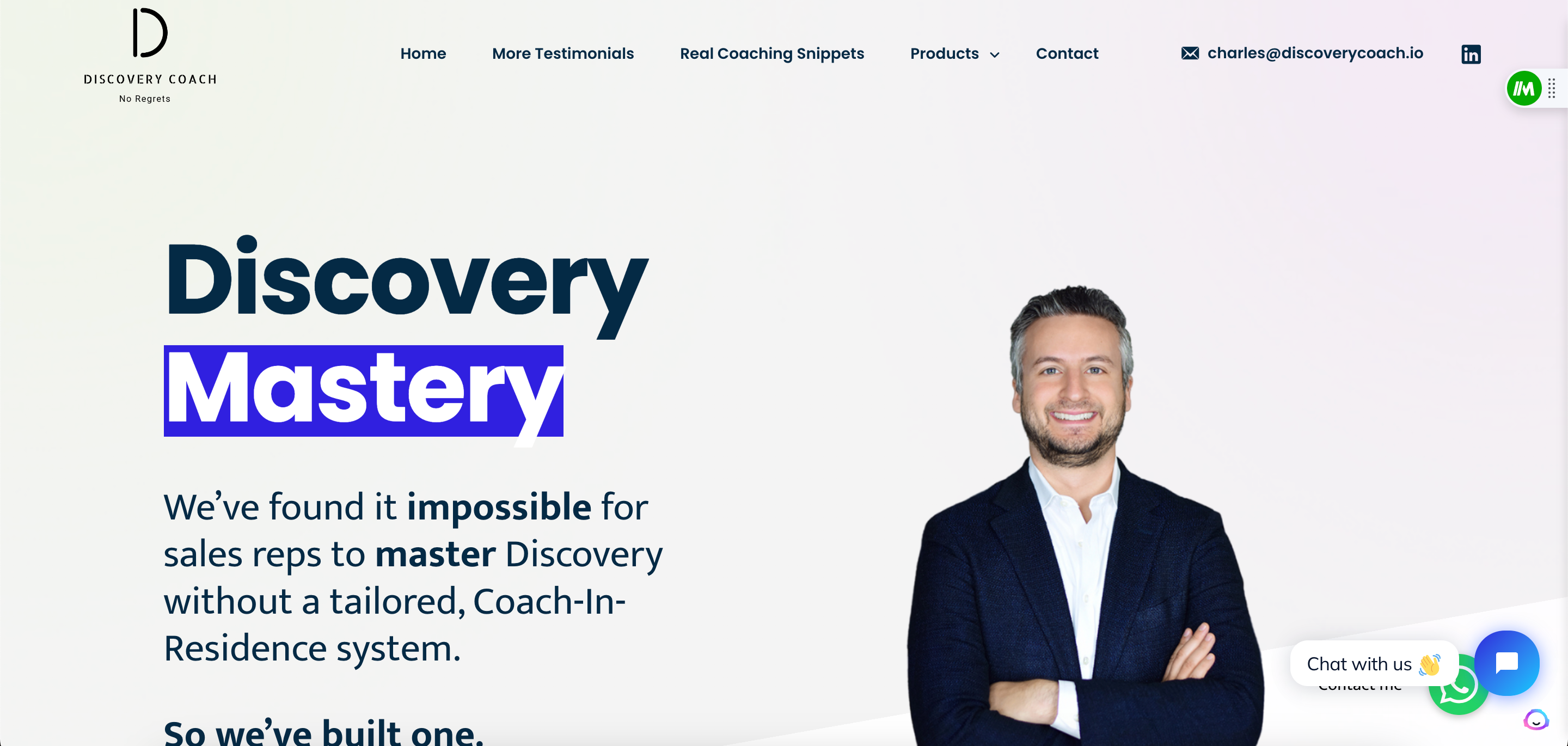
Something different with a small business consulting website you might want to consider is bringing the product…aka YOU…front and center. This can really humanize your firm and help potential clients feel like they are working with a real person, rather than just a faceless corporation. Discoverycoach.io does this well by featuring their founder on the homepage and highlighting his expertise in the consulting industry. Charles also sells to tech salespeople, so used .io on his domain. Proving he knows his buyer well and wants to be tech forward.
Sales Introverts
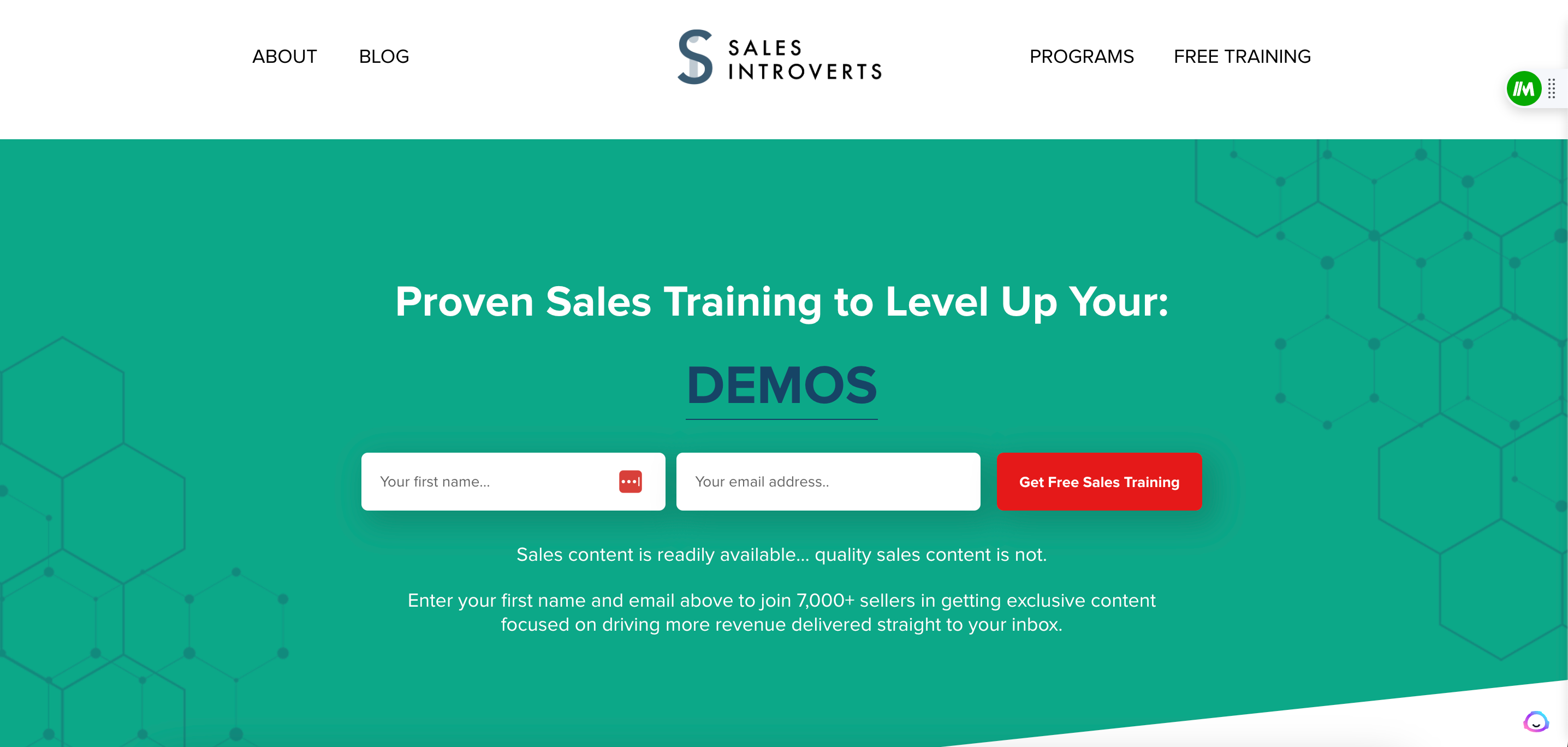
If you’re reading this, you could get a lot of value from this example. Kyle, who runs Sales Introverts, offers a free training to anybody and everybody who visits his site. Why is this important? With every submission, Kyle is not only building a group of people who can test and trust his work. But, he’s also got an evergreen email list that he can continue to market to and target in the future, for other offerings. This, my friends, is high level website design!
Lawrence Adjah
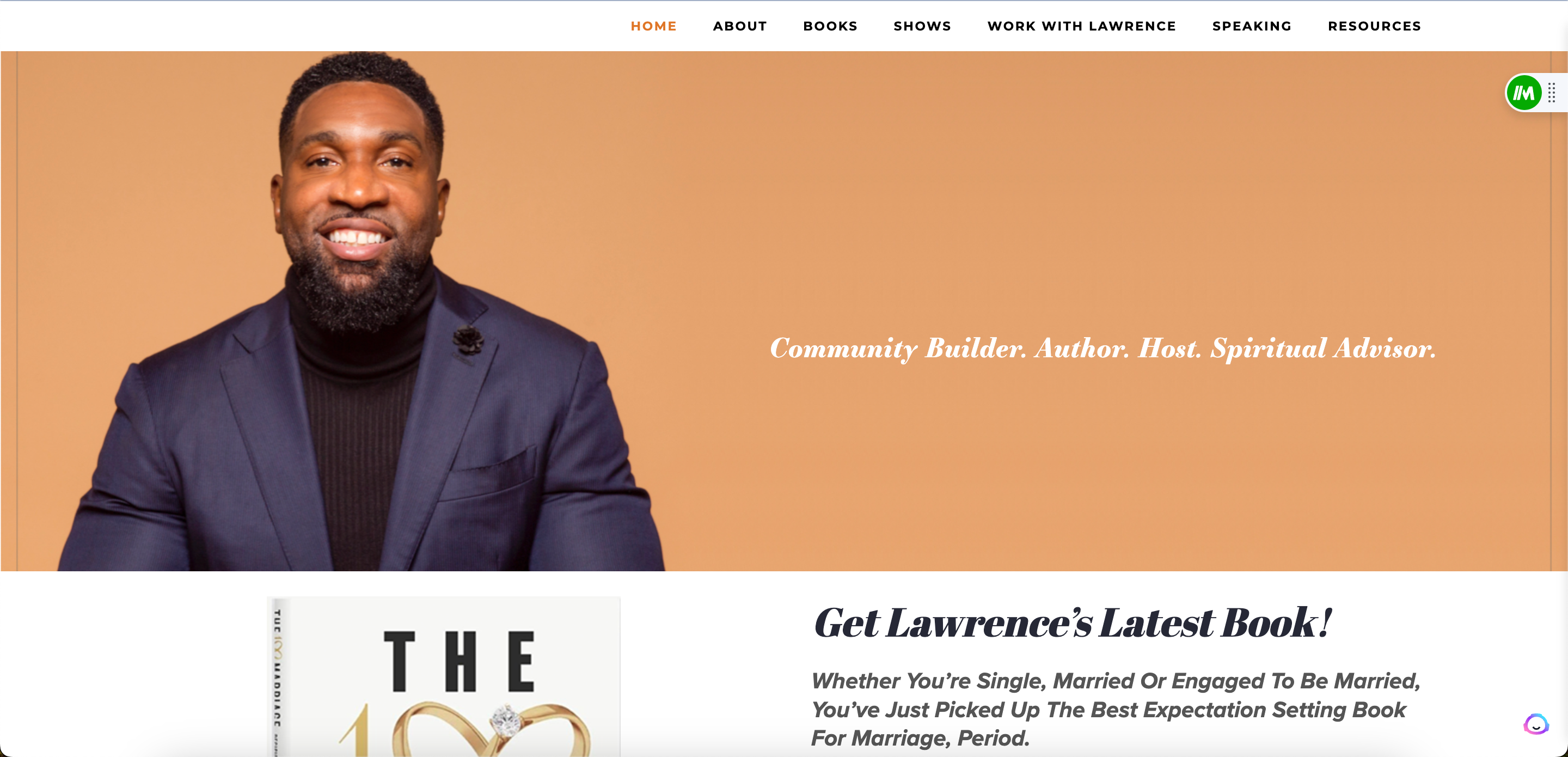
Another great example of a website that allows you to get to know the consultant almost instantly. The warm colors, professional picture, and the copy set together here left me with a feeling of ease. Lawrence also uses his site to promote his new book! A great way to double dip with your audience.
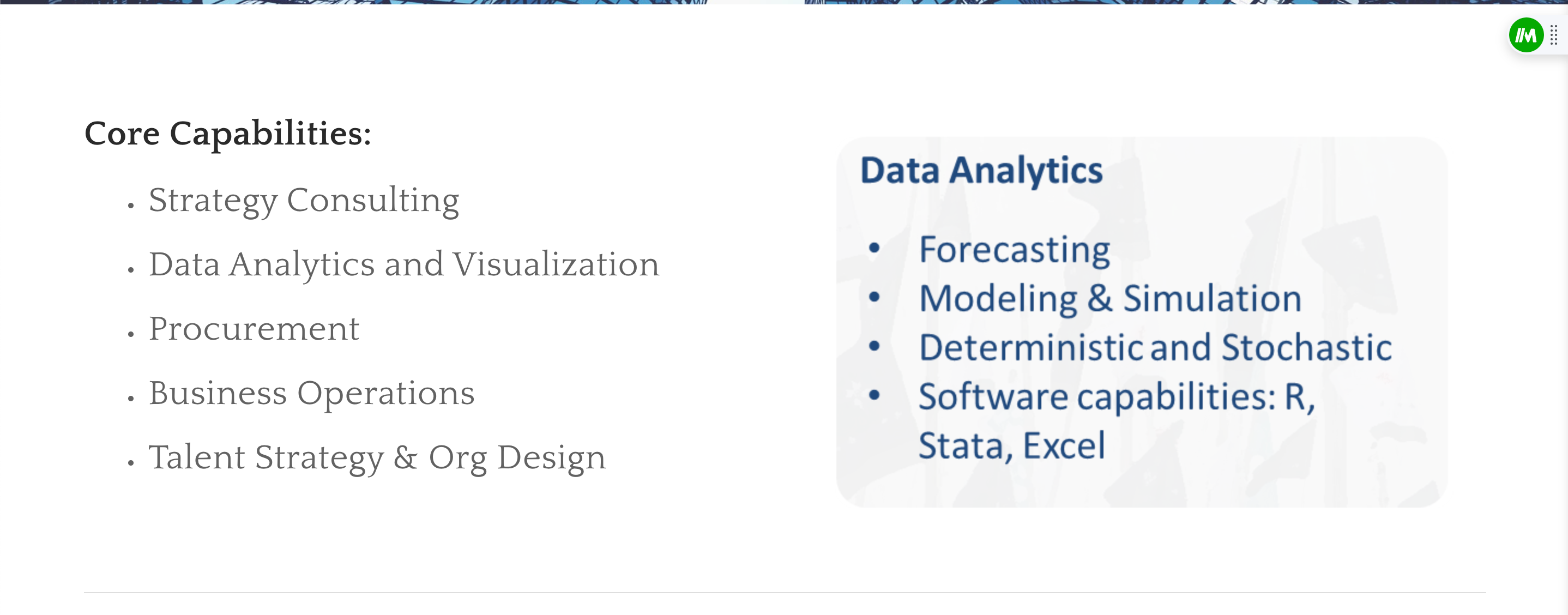
760 Blue
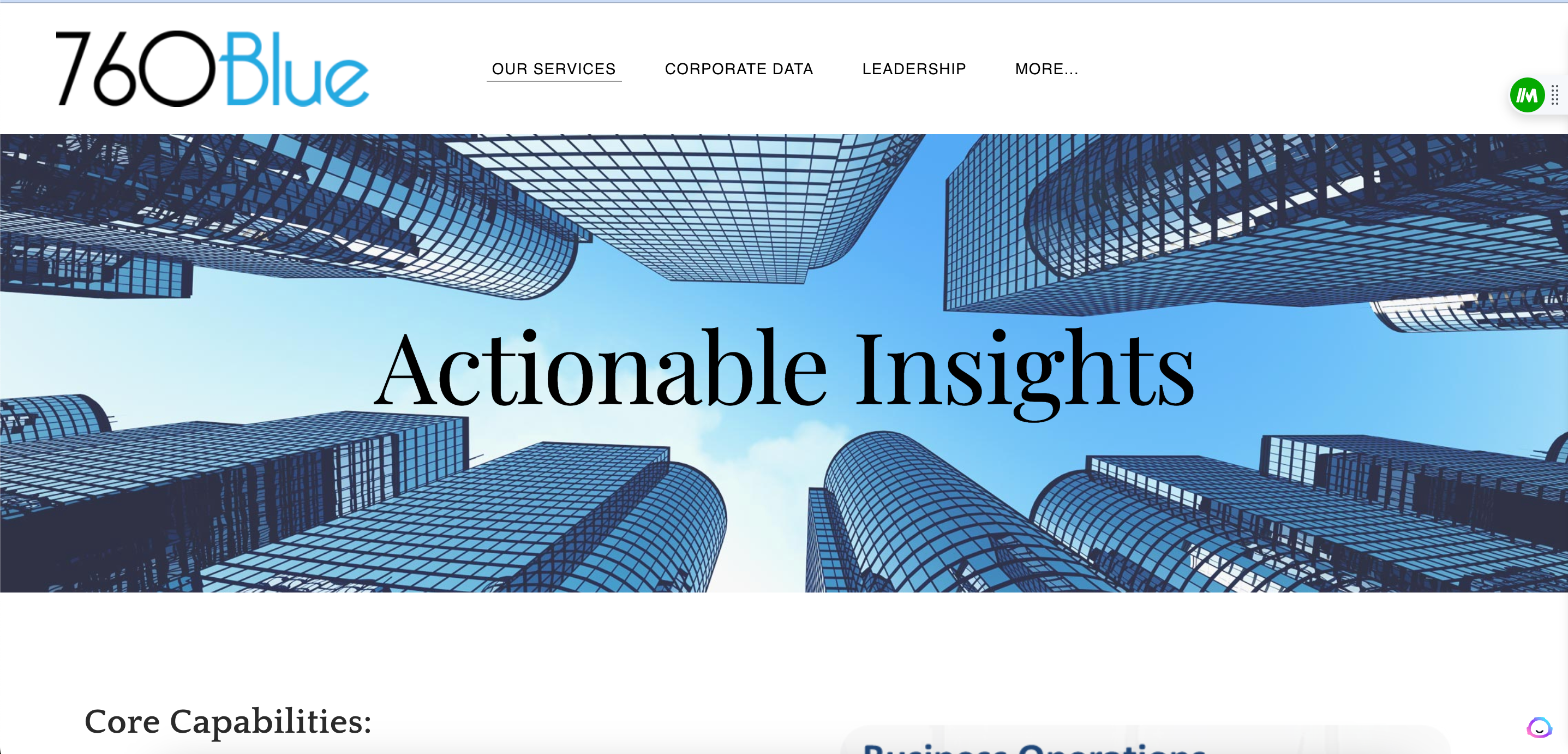
Straight to business, the pros at 760 Blue are! On the homepage (pictured above), they don’t mince words. Actionable Insights, it is. Right under the fold there is their suite of offerings (pictured below). Up close and personal! A bright colored CTA could help this site but it’s a great basic website for a consulting firm.
Epicural
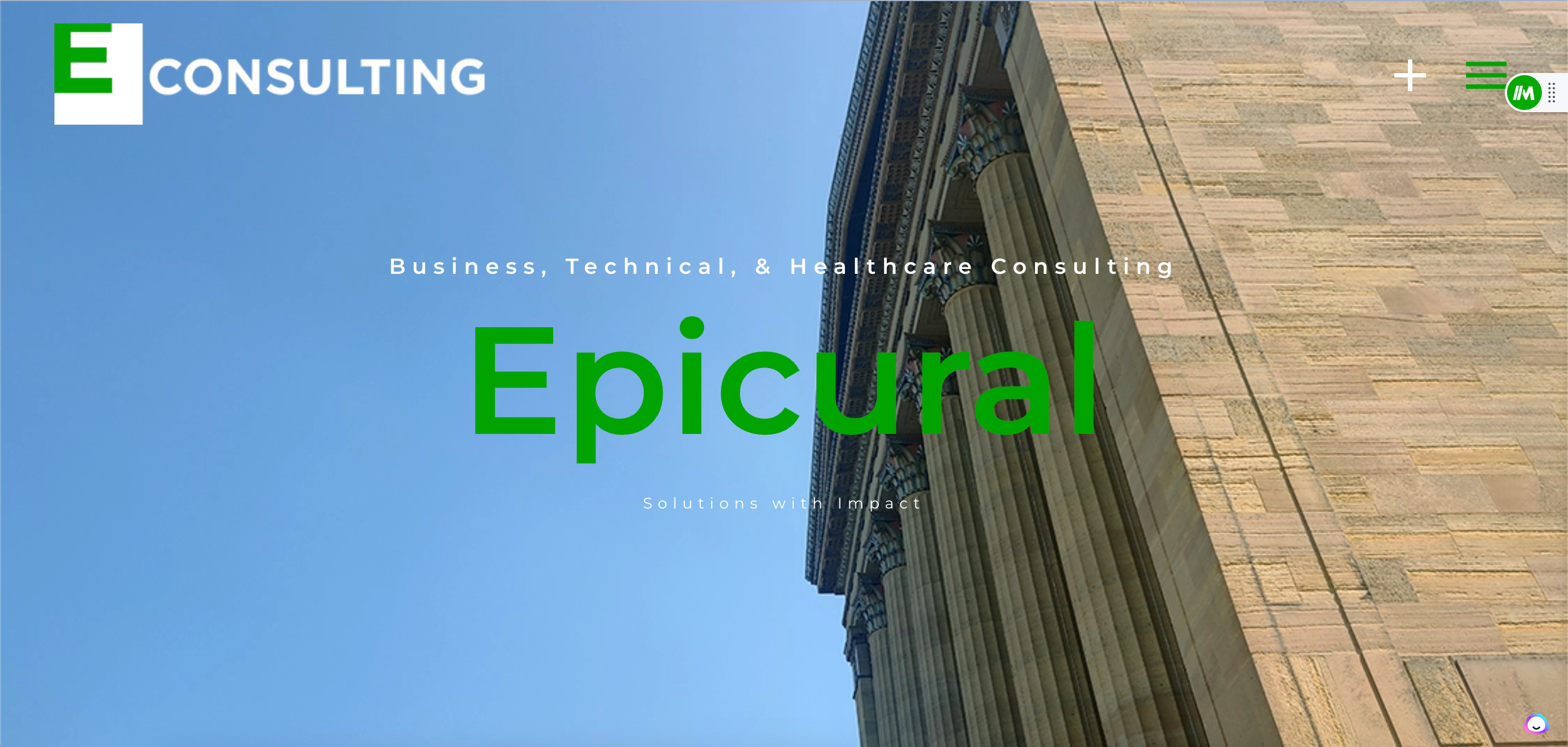
After reading this homepage, are you aware what Epicural does? Sure are. They do business, technical, and healthcare consulting. Once great thing a website does for a consulting firm is provide clarity. Visitors shouldn’t wonder wonder if they’re at the right place when they land on your site. Sites like Epicural make sure they do not!
Blue Sky Partners
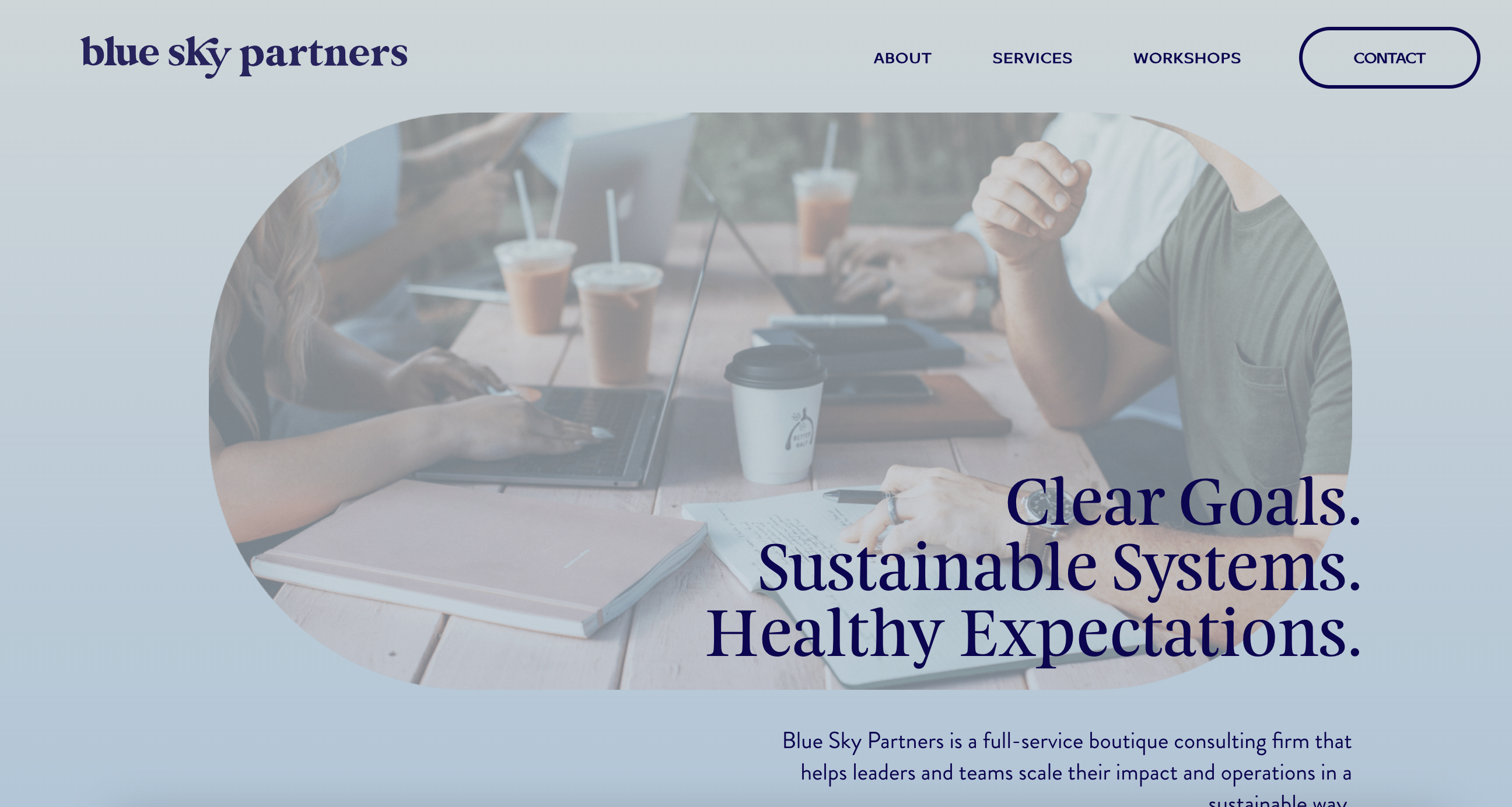
Everything about this website makes me feel easy. I mean, you’re probably not shocked the site is blue. But, the blue make the site very approachable and even the logo presents itself as…cool. Great job making a website that makes the viewer “Feel” something!
Renegade
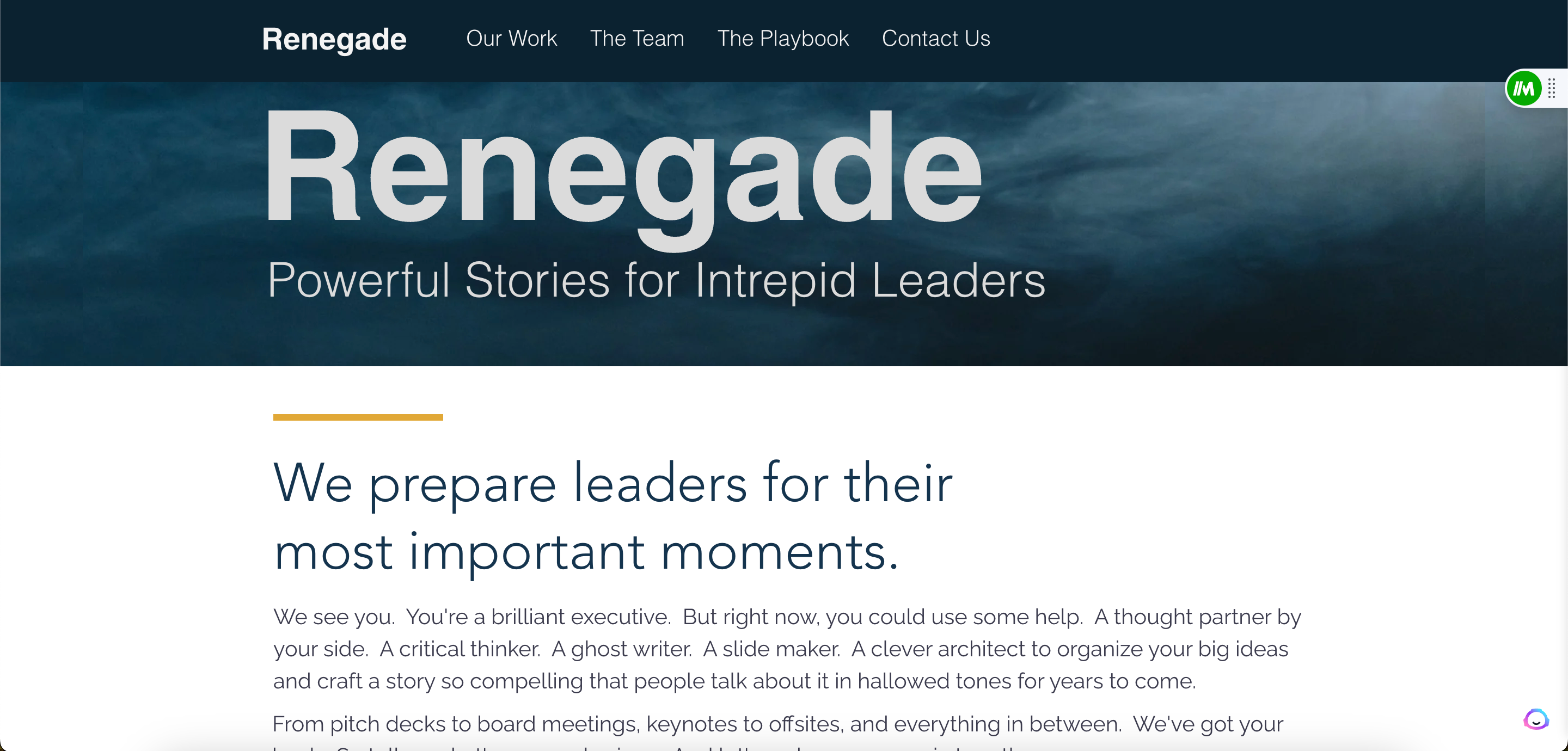
Remember when I said Blue Sky Partners makes me feel at ease? Well, this website does the opposite. And that’s the point. This website uses language and brevity to increase intensity and drive urgency to readers. If you’ve got an important moment coming up, and need somebody to match your intensity this is the kind of website you want to reach!
The Navio Group
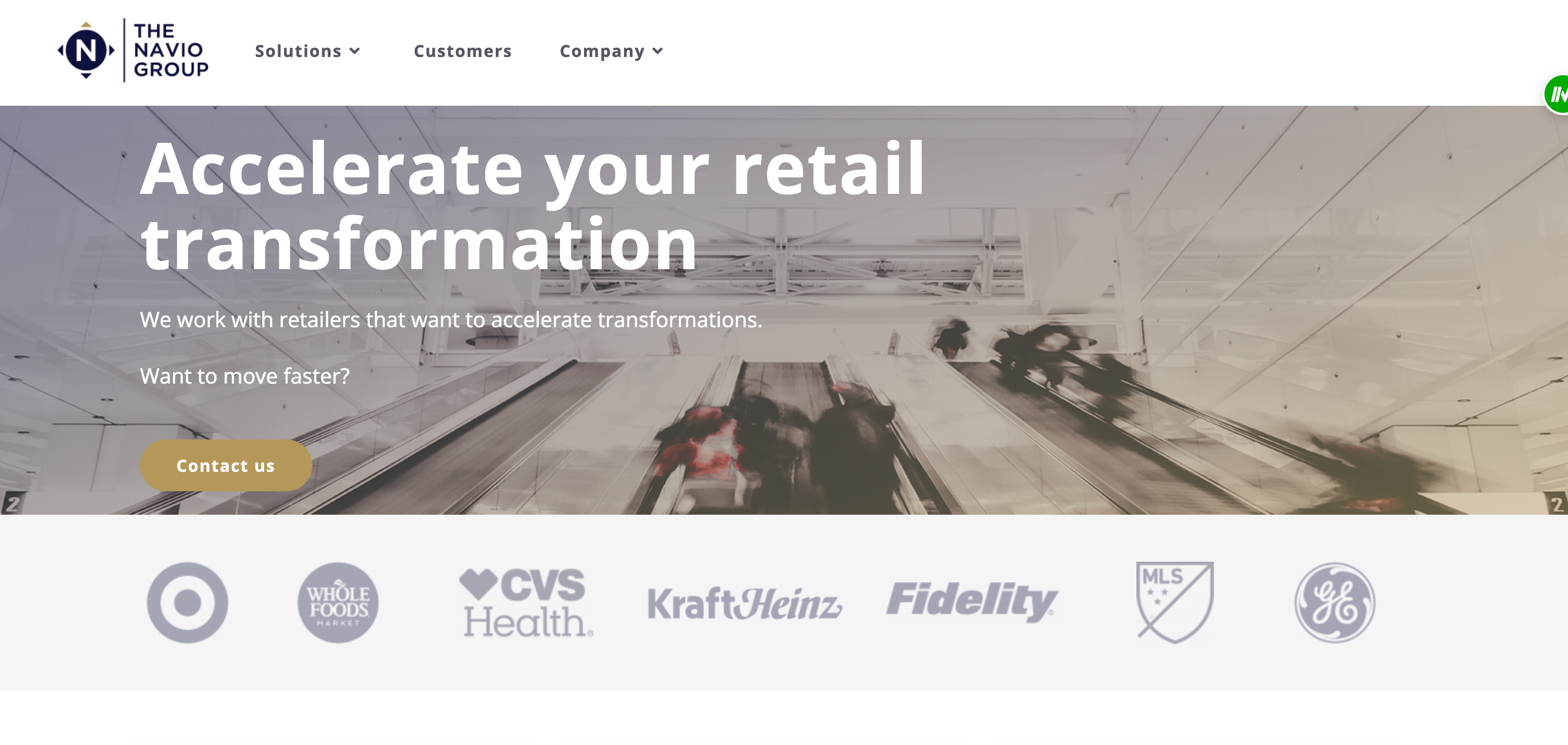
The Navio Group works with retailers. How did they prove it? By adding some of the most recognizable retailers in world on their website, as customer proof points. As soon as you see Target, GE, or Fidelity you know this firm means business.
Chime Partners
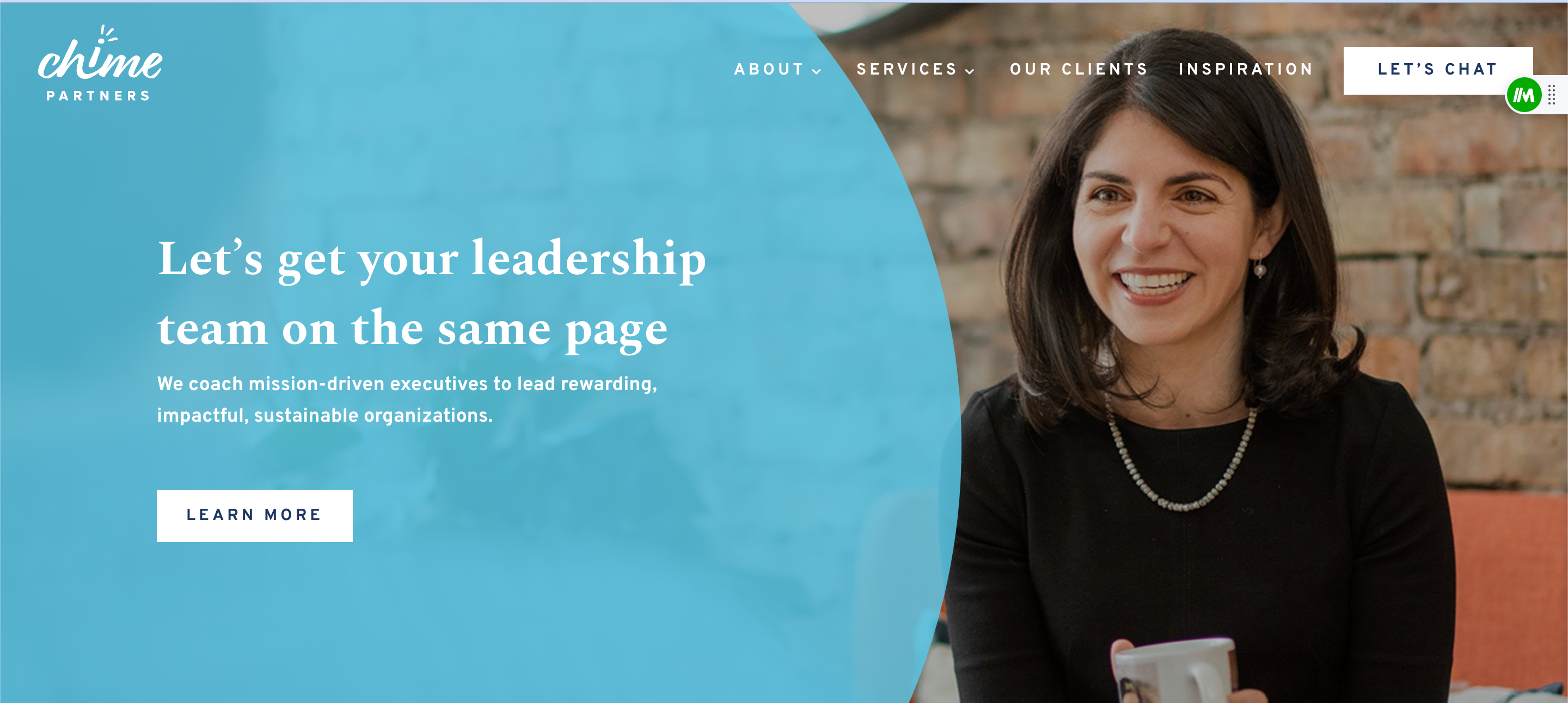
Really impressed by this site. Great branding, a fantastic color scheme and logo, clear focus on non-profit work, and a great CTA. The CEO, Allison, is front and center and you can easily read about her experience, access testimonials, and learn about their services.
Robbie Kellman Baxter
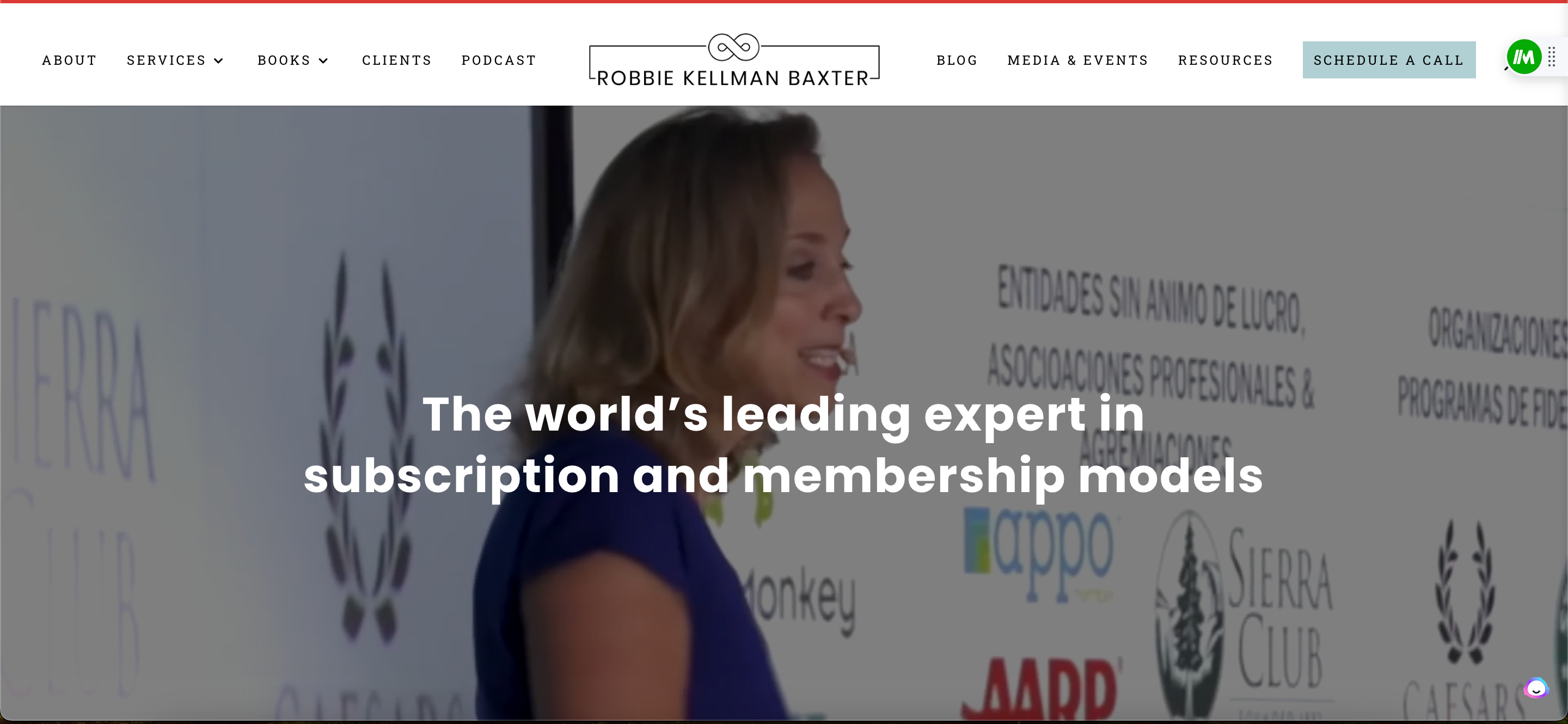
Notice anything about the copy on her website? It says “The world’s leading…”
Trust me, if you’re on the market for subscription and membership models, finding Robbie’s website feels like you hit the jackpot! A well thought out website with tons of information & resources, there’s also a great CTA that allows you to book a call in real time.
Becker Management Consulting
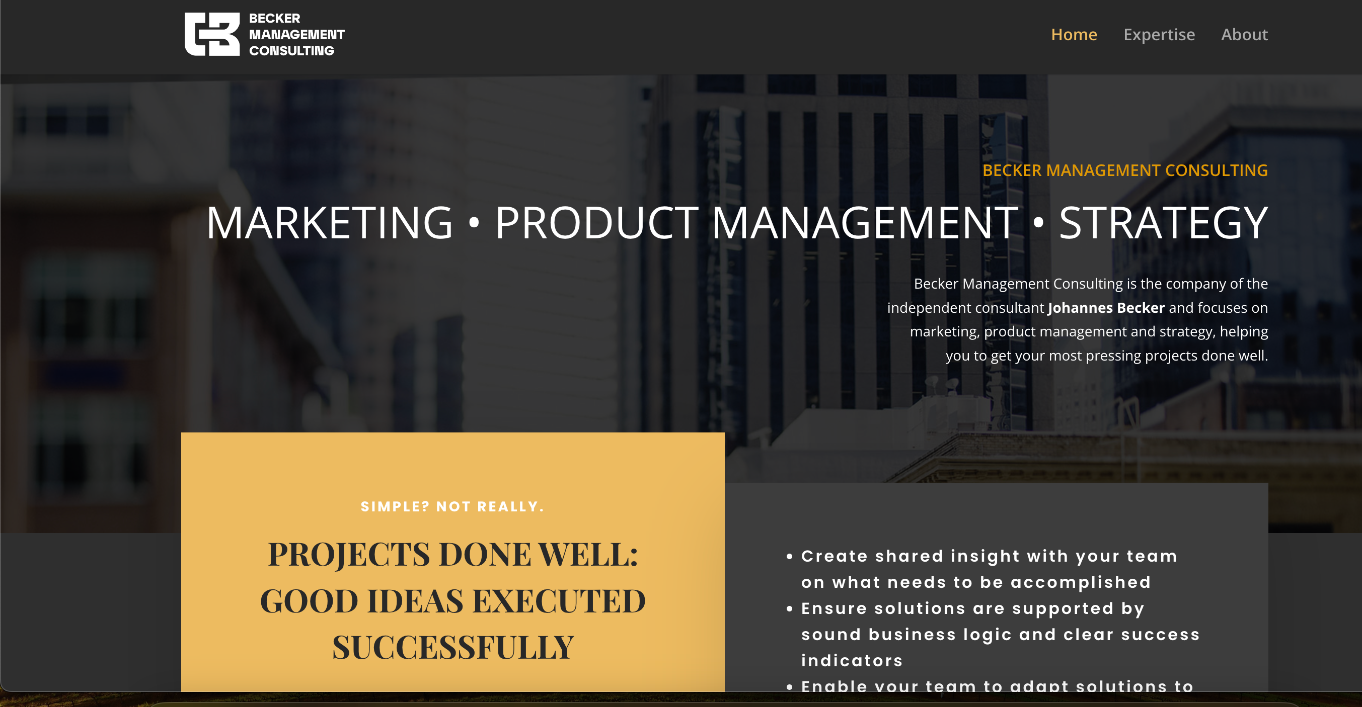
Another solid example of a basic website that gets the job done! A home page that details offerings and allows people to learn more about the team, in this case an independent consultant. I really like the logo and branding. Could use a testimonial or two, but solid website nonetheless.
Relevant Solutions

I chose this example because of the tagline, “Leadership Learned”. As a firm that’s over 20 years old, Relevant Solutions doesn’t pitch the cutting edge this…or AI that. They sell what they have…which is experience. A masterclass in marketing your unique value prop.
Amanda Setili
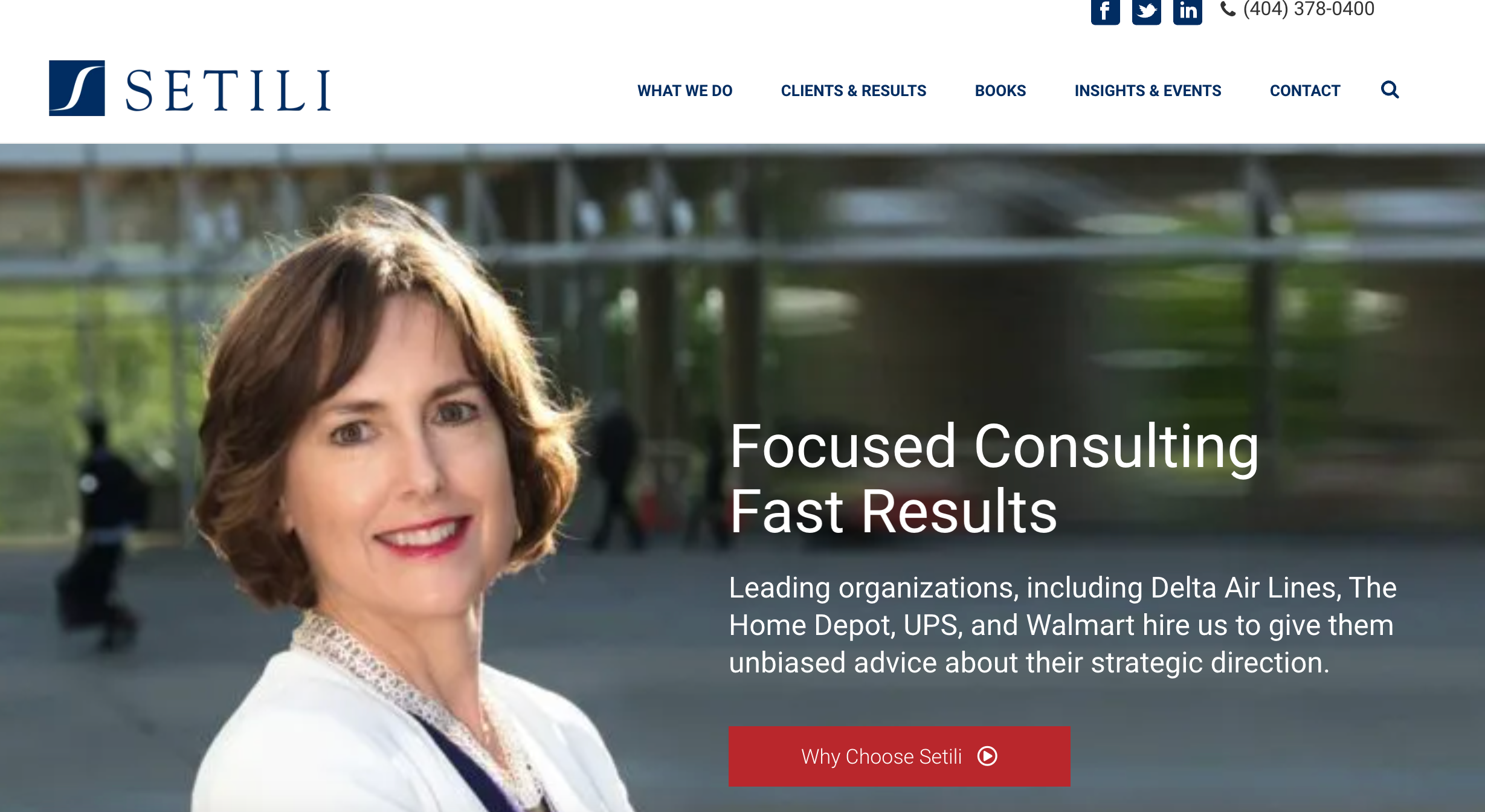
Great example of a brand and consulting website leaning into the marketing of, “Me”. The site has all the same tabs as a larger org but also allows you to reach out and connect directly with the consultant, herself. That’s one thing a large corporation cannot provide! So, use it to your advantage.
Mile Zero
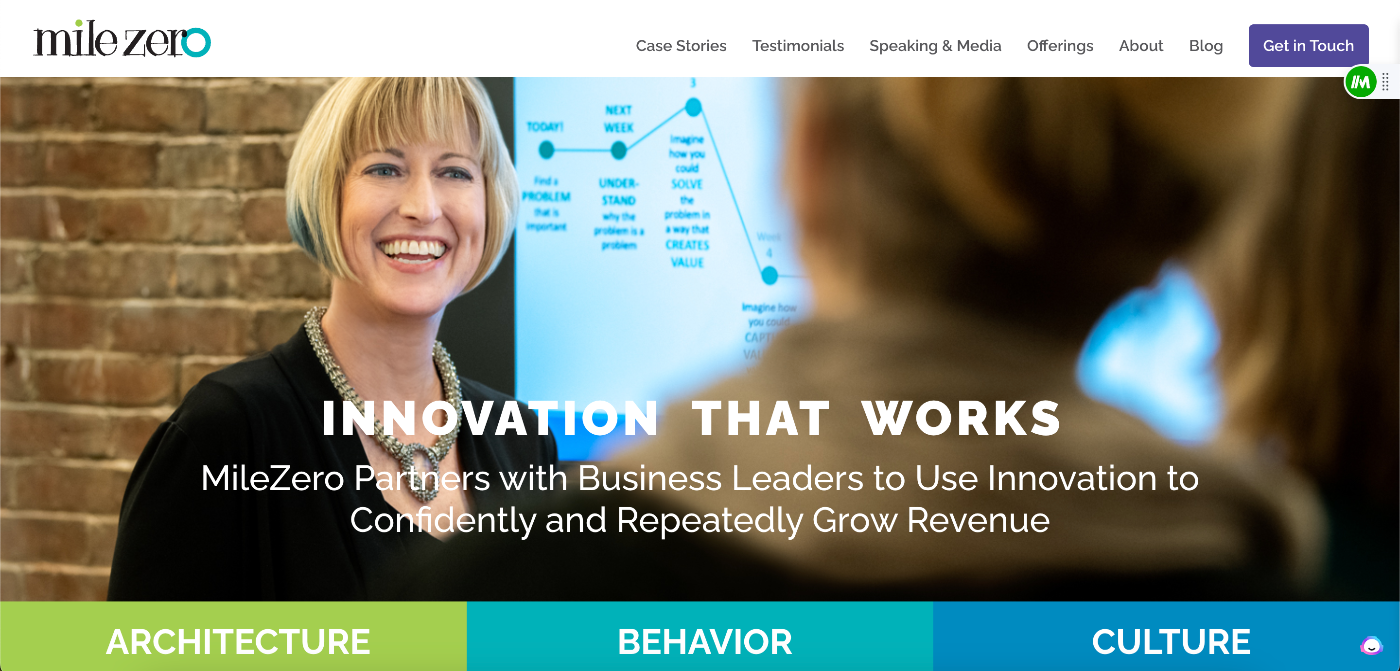
Digging the branding and the logo around Mile Zero. That being said, it doesn’t overshadow the star of the show – the founder, Robyn. This website is a reflection of her. Vibrant, colorful, and ready to take on challenges with you. Oh, and bonus points for the purple CTA in the header and the footer.
Chris C. Fox Consulting
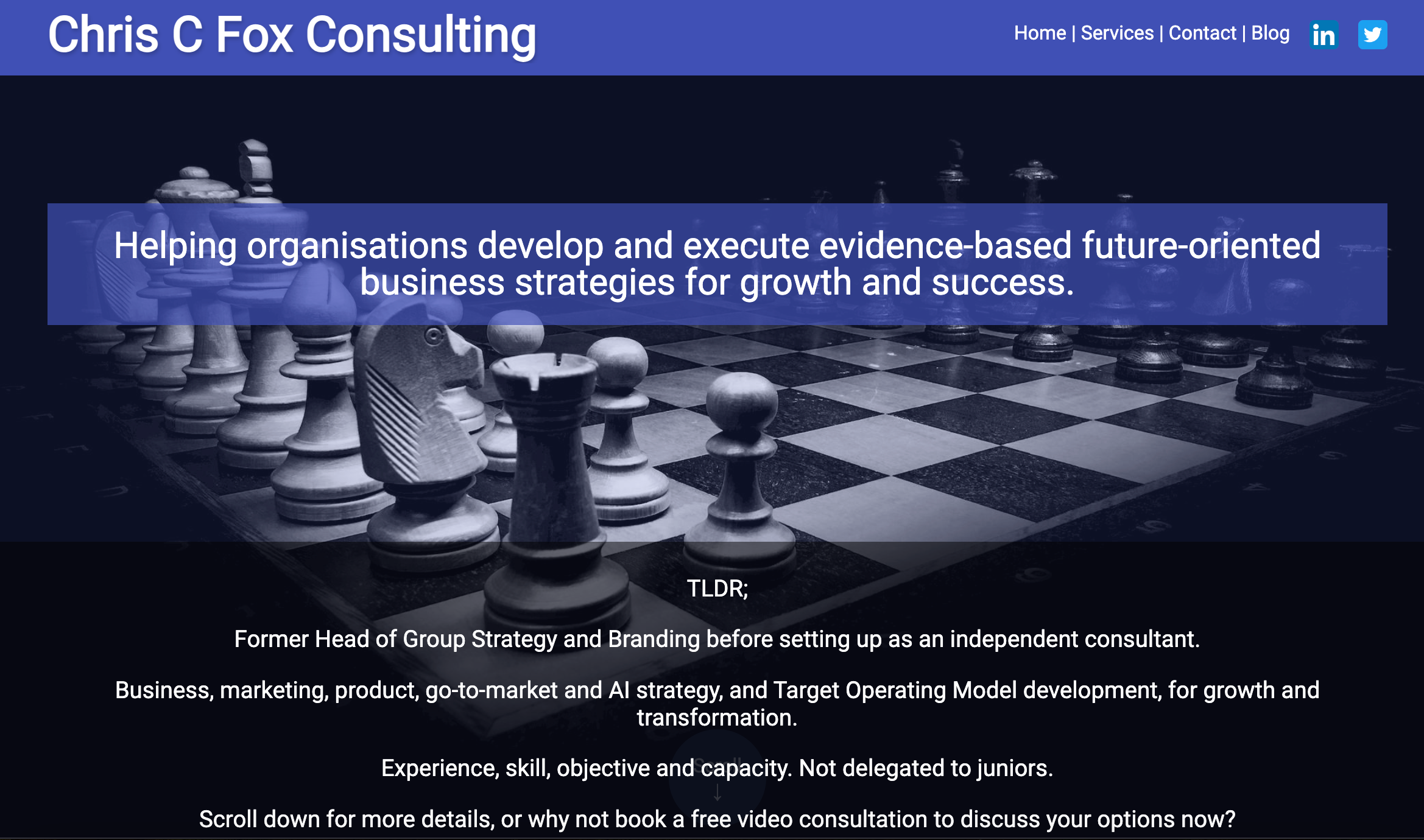
I feel like I can tell a lot about Chris and how he works from his site. And, that’s a good thing. I’m guessing he takes each engagement seriously and is a “Measure twice, cut once” type of guy! If you’re looking for a strategic consultant, well, that’s the guy you want!
Conclusion
Big or small, local or multi-national, established or just getting started – you can have a fantastic website. I hope these examples shed light on what’s possible and maybe, just maybe, inspire some ideas for your own consulting websites!